
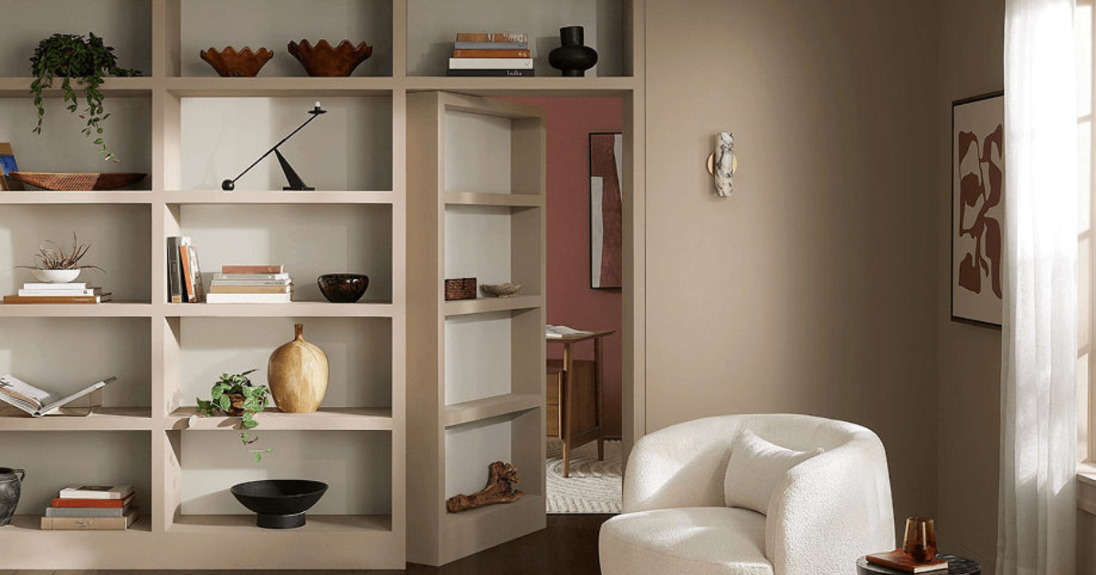
A welcoming home starts with a color palette that feels comfortable to live in. If you’re considering a neutral that brings more depth than off-white, Sherwin-Williams Sanderling SW 7513 deserves a closer look.
Sherwin-Williams selected Sanderling as its November 2026 Color of the Month. This taupe-beige offers an earthy foundation for interiors, making it an appealing starting point for relaxed living rooms, bedrooms, home offices, and gathering spaces.
For South Florida homeowners planning an interior painting project, Sanderling offers several design possibilities. Picture it alongside woven textures in a coastal living room, rich wood furniture in a home library, or soft neutral upholstery in a contemporary space.
At Tru Colors Contracting, we help homeowners refresh their interiors with thoughtful preparation and professional painting. Here’s how to approach Sanderling, its coordinating colors, and the details that help a new palette feel connected to your home.
What Color Is Sherwin-Williams Sanderling?
Sanderling SW 7513 is a neutral paint color in the taupe-beige family. Its appeal comes from the balance between earthy beige and a more muted taupe character. It can provide a softer backdrop for furnishings while giving walls a more defined presence than a pale cream.
Think of it as a foundation for a layered room. Light upholstery, natural wood, textured rugs, and darker accents can each contribute contrast without requiring a bright wall color.
Its appearance will depend on the room. A sunny space may bring out a different impression than a shaded bedroom, and nearby materials can influence how warm or muted it looks. Sample it beside your flooring, countertops, and trim before choosing it for the entire space.
Why Consider Sanderling for a South Florida Home?
A coastal interior does not have to rely on blue walls and white furniture. A taupe-beige palette offers another way to create a relaxed atmosphere, with texture and natural materials carrying much of the design.
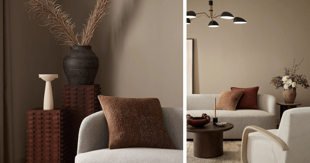
Our design suggestion: pair Sanderling with linen-look upholstery, woven baskets, wood accents, and lighter curtains. Add greenery or artwork for color, then repeat a few finishes throughout the room to keep the space cohesive.
Sanderling is also worth sampling when you want to update a home while keeping existing furnishings. Before committing, compare it with the permanent elements that will remain: tile floors, stone surfaces, cabinetry, and large furniture pieces. A coordinated wall color should work with those features as well as your new décor.
For open floor plans, view samples from adjoining rooms. A paint color that looks balanced beside a living room sofa may create a different effect near kitchen cabinets or under dining room lighting.
Where to Use Sanderling Inside Your Home
Living Rooms and Family Rooms
Sanderling can serve as the backdrop for a comfortable seating area. For a lighter composition, consider cream upholstery, pale wood, and a textured rug. For a more grounded look, introduce darker wood furniture or deeper accent colors in smaller doses.
If your living room connects to a hallway or kitchen, consider how the wall color will meet adjoining finishes. Plan those transitions before painting begins.
Bedrooms
For a restful bedroom scheme, try Sanderling with light bedding, layered textiles, and simple wood furniture. Use samples to decide whether you prefer a lighter trim contrast or a closer tonal relationship.
Check the color under the lamps you actually use at night. Bedroom lighting is part of the finished palette, and an evening sample check can be as useful as viewing it in daylight.
Home Offices and Libraries
Sanderling offers a neutral setting for desks, shelving, books, and artwork. It is a candidate for homeowners who want their office to feel connected to the rest of the home.
Painting walls and built-ins in the same color can create a more unified appearance. However, walls and cabinetry may require different coatings, preparation, and sheen levels. Discuss each surface separately when planning the project.
Dining Rooms and Entryways
In a dining room, consider using Sanderling as a backdrop for wood furniture, upholstered chairs, and statement lighting. Seasonal decorations can then introduce changing accents throughout the year.
An entryway provides another opportunity to connect your palette. Compare the proposed wall color with the front door, nearby trim, and the rooms visible from the entrance.
Sanderling Coordinating Colors: The Quiet Harmony Collection
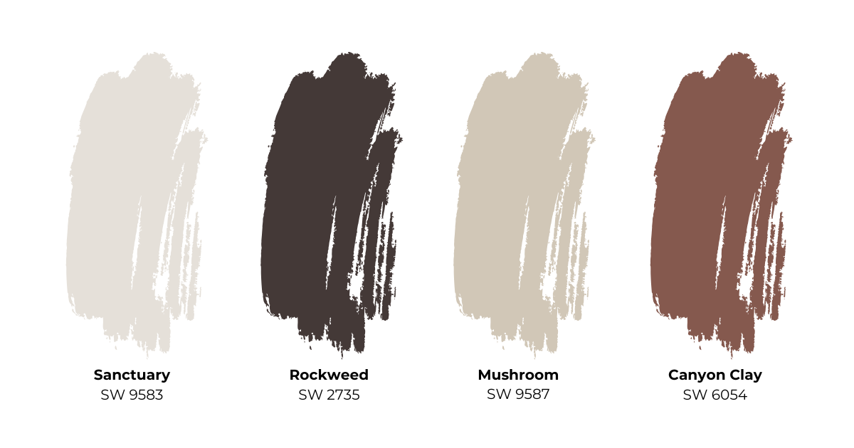
Sherwin-Williams pairs Sanderling with four shades in its Quiet Harmony Color Collection. The following applications are our design suggestions for exploring that palette in your home.
| Coordinating color | Color number | Design idea to explore |
|---|---|---|
| Mushroom | SW 9587 | Sample alongside Sanderling for a layered neutral scheme in adjoining spaces. |
| Sanctuary | SW 9583 | Compare as a companion for ceilings, trim, or nearby walls, checking the contrast in person. |
| Canyon Clay | SW 6054 | Explore on an accent wall or smaller painted feature to introduce an earthy color note. |
| Rockweed | SW 2735 | Consider for a contrasting door, built-in, or furniture piece after reviewing samples together. |
You don’t need to use all five colors to create a complete room. Start with Sanderling and one coordinating shade, then use furnishings and accessories to add variety.
When choosing trim, place samples directly beside each other. An existing white can influence how a new wall color reads, so include your current trim in the comparison even if you plan to keep it.
How to Test Sanderling Before Painting
A screen image is useful for inspiration, but a physical sample provides a better basis for choosing your wall color.
- Compare it with permanent finishes. Place the sample near floors, countertops, tile, and cabinetry.
- Check several locations. View it near a window, on a shaded wall, and beside adjoining rooms.
- Review it throughout the day. Compare morning light, afternoon light, and evening lighting.
- Include trim and ceiling colors. Evaluate the whole combination.
- Consider the intended finish. Sheen changes how a painted surface reflects light, so discuss finish selection before application.
For an exterior project, review samples outdoors beside the roof, pavers, stone, and other fixed materials. Sanderling is listed for interior and exterior color use, but the coating system must suit the surface and exposure. Confirm any applicable community color requirements before work begins.
Professional Interior Painting Starts With Preparation
Choosing Sanderling is one part of the project. The condition of the surface, the coating selected, and the application all affect the finished appearance.
At Tru Colors Contracting, our interior painting approach includes evaluating surfaces and planning the preparation needed for the agreed scope. Depending on the project, that may include protecting furnishings and floors, cleaning surfaces, filling minor imperfections, sanding repairs, caulking appropriate gaps, and priming where needed.
Existing damage deserves attention before fresh paint is applied. If a wall shows staining, peeling, or signs of moisture, the cause should be evaluated and addressed as appropriate before repainting.
Walls, doors, trim, and cabinets also have different requirements. Matching the coating to the surface and expected use helps turn a color idea into a practical painting plan.
Refresh Your Home With Tru Colors Contracting
Whether you’re updating a single room before holiday gatherings or planning a broader interior refresh, Sanderling offers a versatile palette to explore.
Founded in 2010, Tru Colors Contracting is a family-owned South Florida business and licensed Florida Certified General Contractor. We provide residential and commercial painting, waterproofing, stucco repairs, and metal and wood refinishing throughout Broward, Miami-Dade, Palm Beach, Martin, and St. Lucie counties.
Ready to discuss your next painting project? Contact Tru Colors Contracting at 954-973-5600 to schedule a free estimate.
Frequently Asked Questions About Sanderling SW 7513
What is the November 2026 Sherwin-Williams Color of the Month?
Sanderling SW 7513 is the Sherwin-Williams November 2026 Color of the Month. It is a taupe-beige neutral featured with the Quiet Harmony coordinating palette.
Is Sanderling beige or gray?
Sanderling is best described as a taupe-beige neutral. It offers an earthy beige impression with a muted character. Compare a physical sample with your room’s finishes to see how it reads in your home.
What colors coordinate with Sanderling?
The November 2026 Quiet Harmony collection includes Mushroom SW 9587, Sanctuary SW 9583, Canyon Clay SW 6054, and Rockweed SW 2735.[1]
Can Sanderling work in a coastal-style home?
It is a color worth sampling for a coastal-inspired interior. Our suggested approach is to combine it with lighter textiles, natural wood, woven details, and restrained accents for a relaxed composition.
Can Sanderling be used outside?
Sherwin-Williams lists Sanderling SW 7513 for interior and exterior color use.[2] Select an exterior coating appropriate for the substrate and conditions, and test the color outdoors before making a final decision.
