When you step into a room, what do you feel? Is it a surge of calm that gently envelops you, making the space feel like a sanctuary? Or perhaps the energy of the room ignites a spark within, leaving you ready to tackle the day. On the other hand, a poorly designed space might evoke discomfort, causing tension to creep through your body. All of this isn’t by chance—it’s the result of careful interior design.
Among the most powerful tools in shaping a room’s atmosphere is color. The way we perceive color goes far beyond aesthetics. This is known as room color psychology, a concept that delves into how different hues influence our emotions and behaviors in interior spaces.
What is Color Theory in Interior Design?
When we think about color in interior design, our first instinct is often to consider how colors look in combination. Do the colors clash or complement each other? While that’s important, there’s another layer to consider—how the colors in a room make us feel. This is where color psychology comes into play.
Color psychology in interior design is the study of how colors affect mood and atmosphere. By carefully choosing hues for a space, designers can create specific emotional responses that set the tone for the entire room. These emotions are not random; research into color theory assigns certain feelings to each color, depending on factors such as tint, saturation, and tone.
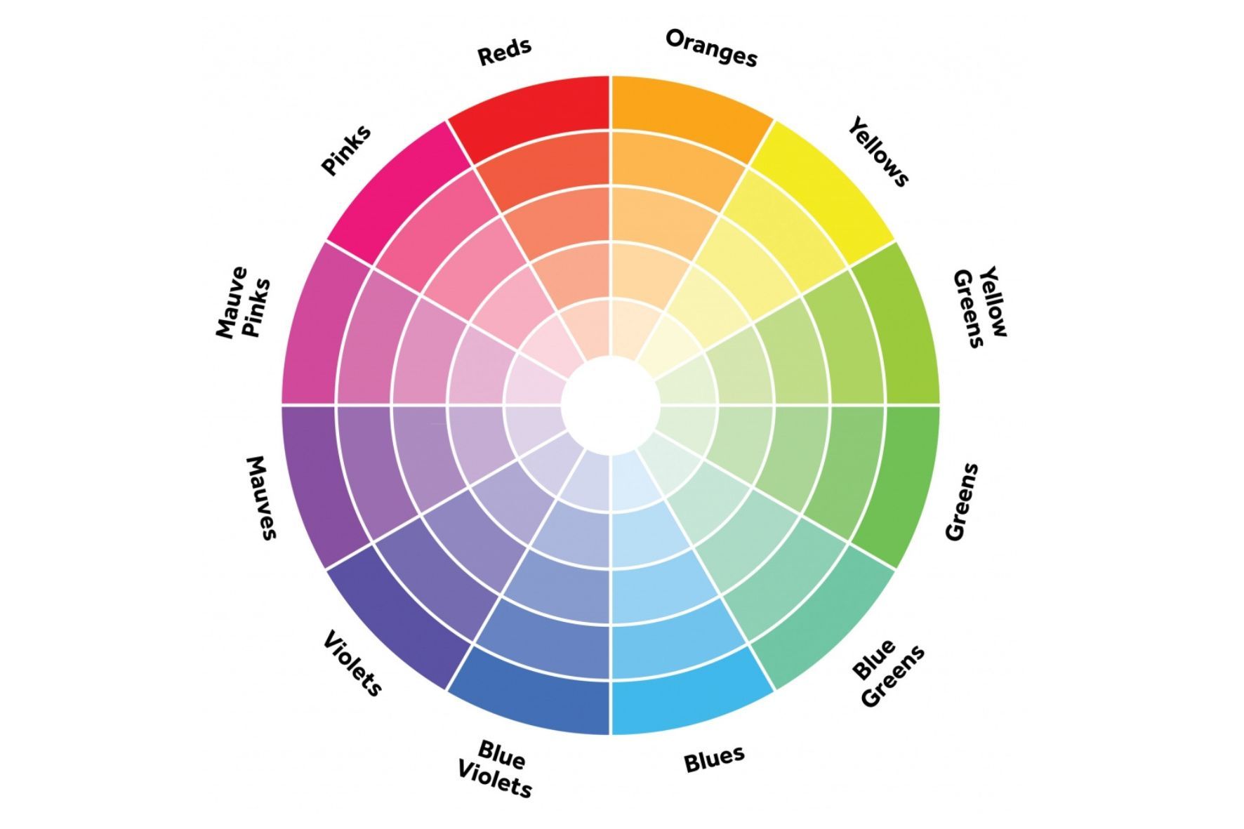
The science of color perception goes back hundreds of years, with early experiments by Isaac Newton in the 17th century forming the basis of modern color theory. Newton’s work led to the creation of the first color wheel, which visually represents how different colors relate to each other. In 1810, Johann Wolfgang von Goethe expanded on this with his “Theory of Colors,” examining how colors affect human emotions. Goethe’s work is still influential in modern color theory, particularly in understanding the psychological effects of color in various applications, including interior design.
While color theory applies to fields like fine arts, fashion, advertising, and industrial design, its relevance to interior spaces is profound because our homes directly influence our daily lives. The colors in our environment can dictate our mood, productivity, and overall sense of well-being. They affect not only how we feel when we’re at home but also how guests perceive our spaces. In short, the colors we choose to surround ourselves with have a huge impact on our emotional state and lifestyle.
The Influence of Color on Moods: What Do Room Colors Mean?
To understand the psychology of color, let’s begin with the basics: the primary colors. The primary colors—red, yellow, and blue—form the foundation of the color wheel. Each of these colors evokes specific feelings and emotions in a space.
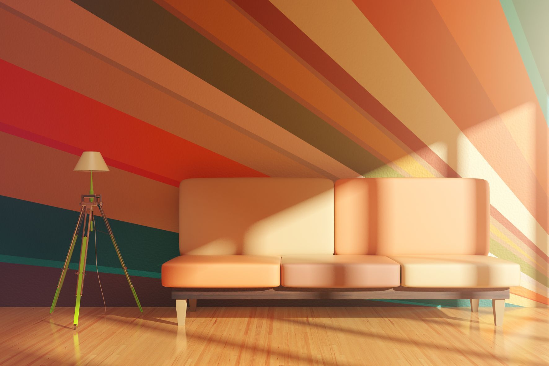
Red: This fiery, bold color exudes power, passion, and energy. It is stimulating and often raises the heart rate, making it perfect for spaces where you want to evoke excitement or encourage lively conversation, such as a dining room. Red can also feel warm and welcoming, though it’s best used as an accent in smaller spaces to avoid overwhelming the room. Yellow: Bright and cheerful, yellow is the color of happiness and optimism. It brings warmth to a space and can make a room feel larger by reflecting more light. A sunny yellow can bring a burst of energy to kitchens or bathrooms, but be cautious—too much yellow or an overly intense shade can provoke anxiety or irritation. Blue: Universally associated with calm, blue is a cool color that promotes relaxation and serenity. It’s a popular choice for bedrooms and offices because it helps create a peaceful, focused environment. Research has shown that blue is particularly effective for spaces where concentration is required, as it has a calming effect on the mind.
Next, we have the secondary colors, which are formed by mixing two primary colors together:
Green: A blend of blue and yellow, green is a color that evokes nature and freshness. It is known for its calming properties and can promote a sense of balance and well-being. Green is ideal for living spaces or bedrooms where relaxation is key. It also symbolizes renewal and growth, making it a great choice for spaces designed to feel rejuvenating. Purple: Combining the warmth of red and the coolness of blue, purple is a rich, luxurious color that evokes a sense of creativity and passion. Deep shades of purple, such as royal purple, are associated with luxury and sophistication, while lighter lavender shades create a more calming, meditative atmosphere. Orange: Vibrant and full of energy, orange is often linked to creativity and enthusiasm. It brings warmth to a space, much like red, but with less intensity. It’s a great choice for informal spaces like playrooms or fitness areas, where you want to feel energized.
While primary and secondary colors are the cornerstones of color psychology, let’s not forget about the so-called “neutral” colors that often serve as a backdrop in interior design:
Black: While it can feel overpowering in large doses, black adds depth, sophistication, and drama when used correctly. A touch of black in a room’s design can ground a space and create a sense of elegance. However, too much black can feel heavy or somber, so it’s best balanced with lighter colors. White: Pure and clean, white symbolizes simplicity, clarity, and openness. White walls or ceilings are often used to make spaces feel larger and brighter. It works well with any color scheme and can create a fresh, tranquil environment, making it a versatile choice for minimalist interiors.
The Complex Nature of Color
Room color psychology isn’t just about picking colors from a palette. Each color has many properties that influence how it is perceived and how it impacts a space. These include:
Tint: Adding white to a color creates a tint, which lightens the color. For example, adding white to red produces a pink tint, which softens the intensity of the original color. Tints are often used in spaces designed to feel airy and open. Shade: When black is added to a color, it creates a shade, which darkens the hue. Darker shades of colors can add depth and drama to a space, making it feel more intimate or sophisticated. Tone: Adding gray to a color creates a tone, which reduces the brightness of the hue. Tones are useful for creating a more subdued, relaxing atmosphere. Saturation: This refers to the intensity of a color. Highly saturated colors are vivid and bold, while less saturated colors are softer and more muted. The level of saturation you choose can significantly impact the mood of a space. Value: This term refers to how light or dark a color is. High-value colors are light and airy, while low-value colors are dark and dramatic.
How to Design with Color
Now that you understand the psychological impact of colors, the next step is applying that knowledge to your interior design projects. The first question to ask yourself is: What mood do you want to create in the space?
For a calm and relaxing environment, opt for cool colors like blue or green. These colors are ideal for bedrooms, bathrooms, or meditation spaces where tranquility is essential. For spaces where you want to encourage energy and creativity, such as a kitchen or home office, warm colors like red, orange, and yellow are better choices.
Another factor to consider is the amount of natural light in the space. A room with ample sunlight can handle darker, richer colors without feeling too enclosed, while a dimly lit room may benefit from lighter tints to help brighten the space.
Once you’ve identified the mood and lighting, you can start playing with color schemes. One of the most popular methods is the monochromatic color scheme, where you use different shades, tints, and tones of a single color to create a cohesive and harmonious look. This can add depth to a space without feeling overwhelming.
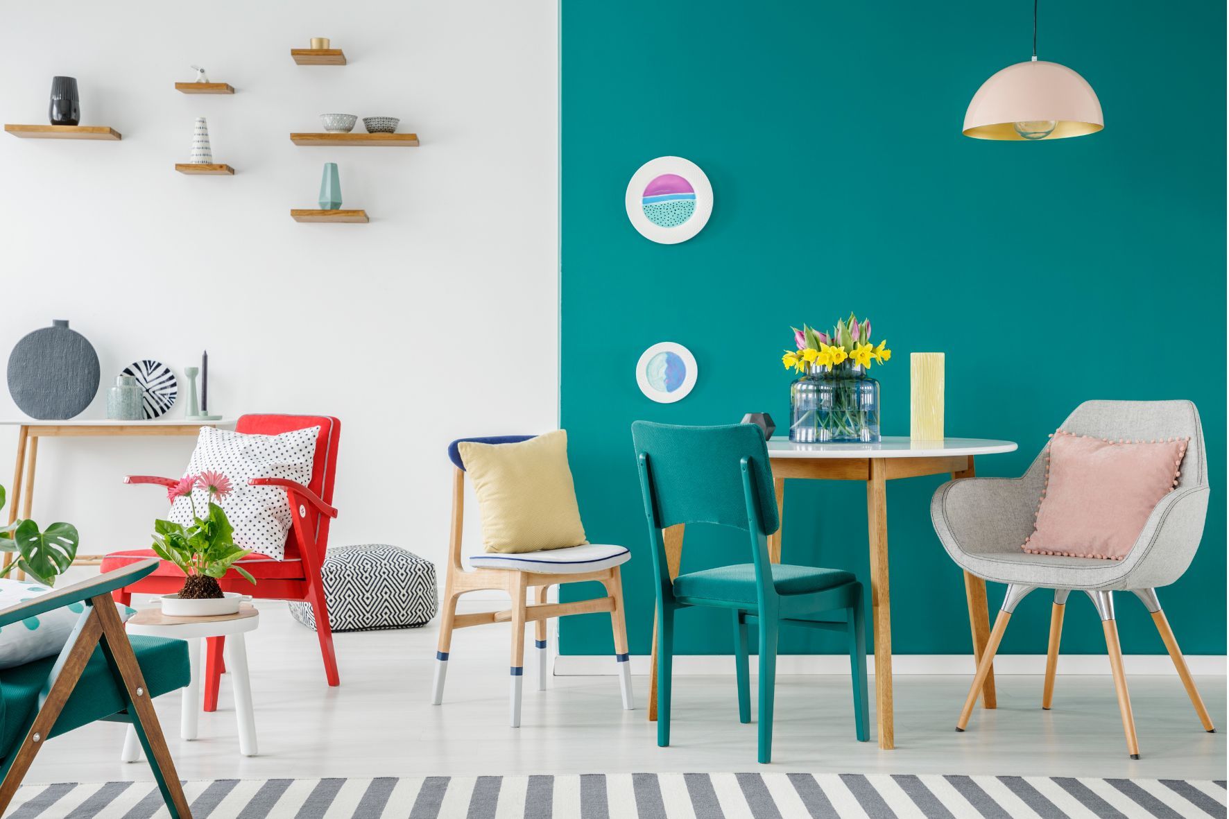
Another option is the complementary color scheme, where you pair colors that are opposite each other on the color wheel. For example, blue and orange are complementary colors that can create a striking, balanced look when used together. This contrast can add vibrancy to a space without feeling chaotic.
For a more subtle look, consider an analogous color scheme, where you use colors that are next to each other on the color wheel, such as blue, blue-green, and green. This type of color scheme creates a serene and cohesive design.
Bringing Your Color Scheme to Life
Once you’ve chosen your colors, it’s time to incorporate them into your space. Paint is the most obvious way to introduce color, but it’s not the only option. Furniture, textiles, flooring, and home decor can all be used to bring your color scheme to life.
When selecting furniture, consider how the colors and materials will interact with the rest of the space. For example, a dark wood table can complement a room with light blue walls, while a bold orange sofa might serve as a focal point in an otherwise neutral room.
Don’t forget the power of accessories. Throw pillows, rugs, artwork, and curtains can all add pops of color without overwhelming the room. Window treatments, in particular, can play a key role in tying a room’s color scheme together. Flowing curtains in a complementary color or sleek shades in a neutral tone can enhance the overall design.
The psychology of color in interior design goes far beyond aesthetics. Colors have the power to influence our emotions, moods, and even behaviors. By understanding how different colors impact a space, you can create interiors that not only look beautiful but also feel right. Whether you’re designing a calm sanctuary or an energetic gathering space, the right color choices can make all the difference in how you and your guests experience a room.