As we look ahead to 2025, a significant shift is on the horizon in the world of interior design and paint. Benjamin Moore, a brand synonymous with color innovation and quality, has unveiled its Color of the Year alongside a carefully curated palette of ten trend-setting shades that encapsulate the essence of comfort and warmth.
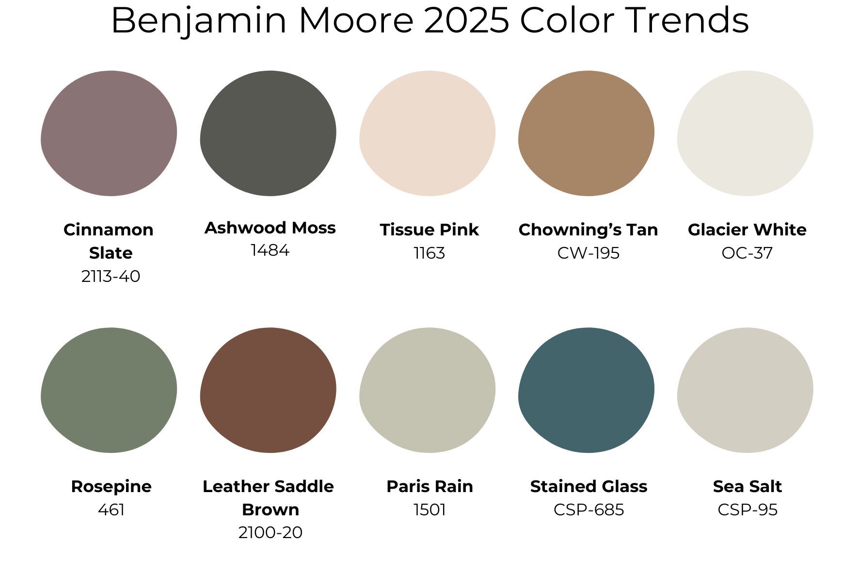
According to the brand, 2025 will be the year of comfort, a theme echoed throughout the newly released Color Trends Palette.
The palette represents a thoughtful selection of hues, reflecting current design trends while also forecasting what will resonate with consumers in the coming year. “Quietly colorful” is how Benjamin Moore describes these shades, and it’s easy to see why. Most of the ten featured paints exude a soft, organic quality that is versatile enough to complement any interior decor style. Hannah Yeo, the manager of color marketing and development at Benjamin Moore, highlights that comforting colors are beginning to overshadow the vibrant, super-saturated shades that dominated recent years.
“In 2023, we really saw the power of color and saturation. But then in 2024, there was a little bit of softening,” Yeo explains. “It’s all about comfort and coziness now—and these shades bring a warm familiarity.” This notion of warmth and familiarity is not just a trend; it reflects a deeper desire for spaces that feel welcoming and safe. As Yeo puts it, “It feels like the friend you just met but after talking to them for a little while, you feel like you’ve known them forever.” This is the vibe that Benjamin Moore aims to evoke with these colors.
The Comfort of Color
The familiar nature of these paints speaks to their reliability, universality, and timelessness. Each shade stands strong on its own while also harmonizing beautifully with others in the palette. This interconnectedness allows homeowners and designers alike to create cohesive spaces that flow seamlessly from room to room. “That’s something we wanted to explore in this palette—the idea that everything works together harmoniously and can be used throughout the whole home,” Yeo emphasizes.
With that in mind, let’s explore the ten colors that Benjamin Moore predicts will dominate the design landscape in 2025. These colors not only offer aesthetic appeal but also inspire creativity in how they can be incorporated into various living spaces.
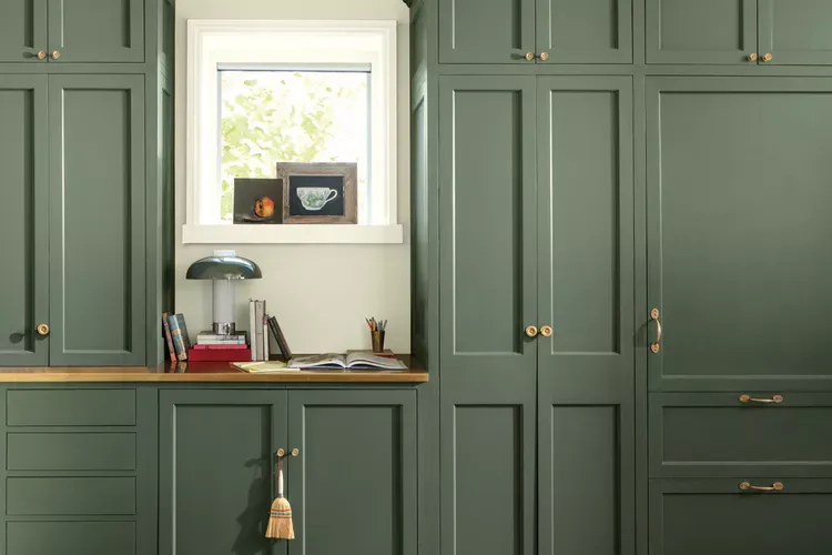
Photo: Benjamin Moore Rosepine
1. Rosepine 461
Rosepine is a rich, inviting green that is particularly well-suited for kitchen cabinetry. Yeo describes it as a color that “brings millwork to the forefront.” Its slightly bright undertone creates a happy and fun vibe, making it an ideal choice for spaces that encourage social interaction and culinary creativity.
One way to maximize the impact of Rosepine is to use it in contrast with bold textures, such as an exposed brick wall. This juxtaposition adds a playful element to the space, allowing the color to shine while creating a dynamic environment that feels both modern and timeless.
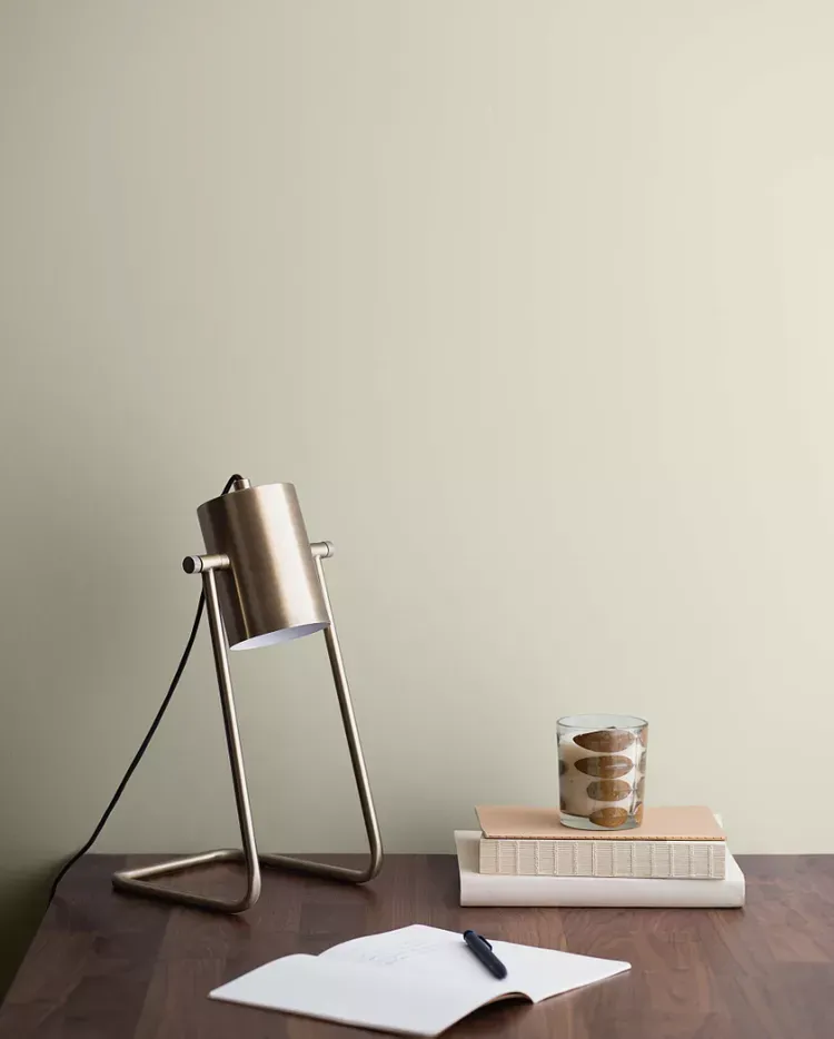
Photo: Benjamin Moore Paris Rain
2. Paris Rain 1501
Paris Rain presents a sophisticated alternative to traditional gray. Its green undertone adds a layer of nuance that makes it feel special and inviting. Yeo recommends pairing this shade with complementary colors to enhance its undertones and set the room’s overall color temperature.
For example, pairing Paris Rain with rosy bedding and window treatments will accentuate its green notes, creating a refreshing and cheerful atmosphere. Alternatively, using black and white accents can maintain a more neutral palette, grounding the space while still allowing Paris Rain to shine as a subtle yet impactful backdrop.
3. Sea Salt CSP-95
Sea Salt is a complex color that boasts a unique blend of pigments, avoiding gray or black. Yeo notes that this complexity gives Sea Salt its versatility, allowing it to pick up different nuances in varying lighting conditions. For instance, the color may appear dramatically different in the soft light of morning compared to the warm glow of afternoon sunlight.
This quality makes Sea Salt an excellent choice for those who appreciate variety and subtlety in their paint colors. Whether it’s used in a cozy living room or a serene bathroom, Sea Salt can adapt to its environment, enhancing the overall mood of the space.

Photo: Benjamin Moore Sea Salt
3. Sea Salt CSP-95
Sea Salt is a complex color that boasts a unique blend of pigments, avoiding gray or black. Yeo notes that this complexity gives Sea Salt its versatility, allowing it to pick up different nuances in varying lighting conditions. For instance, the color may appear dramatically different in the soft light of morning compared to the warm glow of afternoon sunlight.
This quality makes Sea Salt an excellent choice for those who appreciate variety and subtlety in their paint colors. Whether it’s used in a cozy living room or a serene bathroom, Sea Salt can adapt to its environment, enhancing the overall mood of the space.
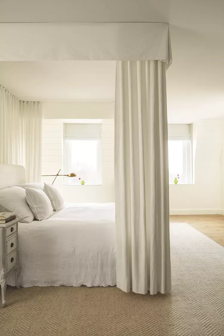
Photo: Benjamin Moore Glacier White
4. Glacier White OC-37
Glacier White embodies a soft and serene aesthetic that adds a sense of calm to any room. Yeo describes it as having “the right amount of depth to prevent it from looking too sterile or too stark.” This warm white has a hint of cream that makes it incredibly inviting.
In isolation, Glacier White creates a soft look that feels clean yet warm, perfect for brightening up dark spaces. It pairs beautifully with a variety of colors, allowing for creative combinations that can elevate a room’s overall design.
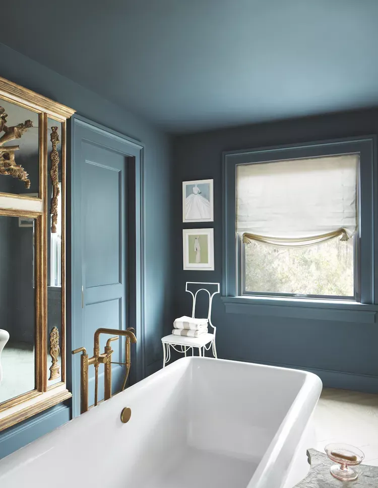
Photo: Benjamin Moore Stained Glass
5. Stained Glass CSP-685
Stained Glass is another complex color that mirrors the qualities of Sea Salt. It requires multiple color pigments to create its unique depth and character. Because of this complexity, Stained Glass can work seamlessly with a wide range of colors and wood tones, making it an incredibly flexible choice for homeowners.
This versatility allows Stained Glass to adapt to various design aesthetics, from modern minimalist to traditional rustic. When paired with complementary hues, it can transform a space, adding warmth and character while remaining elegantly understated.
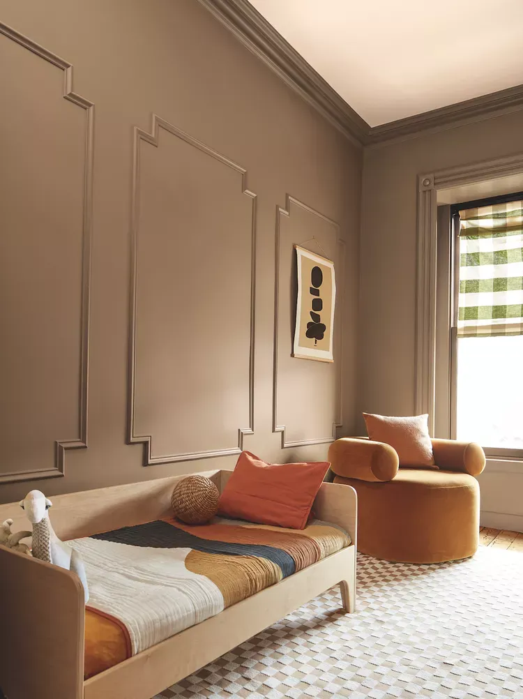
Photo: Benjamin Moore Chowning’s Tan
6 & 7. Leather Saddle Brown 2100-20 and Chowning’s Tan CW-195
Brown is making a strong comeback, with shades like Leather Saddle Brown and Chowning’s Tan leading the charge. According to Yeo, these colors are incredibly versatile, allowing designers to create either formal spaces or casual, comfortable environments.
Brown tones can evoke feelings of warmth and stability, making them ideal for living rooms, dining areas, and bedrooms. For those looking to make a bold statement, consider color drenching a space in one of these rich brown shades to envelop it in a cozy, inviting atmosphere.
Photo: Benjamin Moore Tissue Pink
8. Tissue Pink 1163
Tissue Pink is an incredibly flexible hue that can shift in appearance depending on the lighting. Sometimes it skews more beige, while at other times it takes on a rosy pink tone. “There’s a blush of warmth that just makes you feel good,” says Yeo, highlighting its comforting qualities.
This versatile shade can be used in various applications, from accent walls to full-room transformations. Pairing Tissue Pink with earthy tones can create a harmonious and serene environment that feels fresh yet timeless.
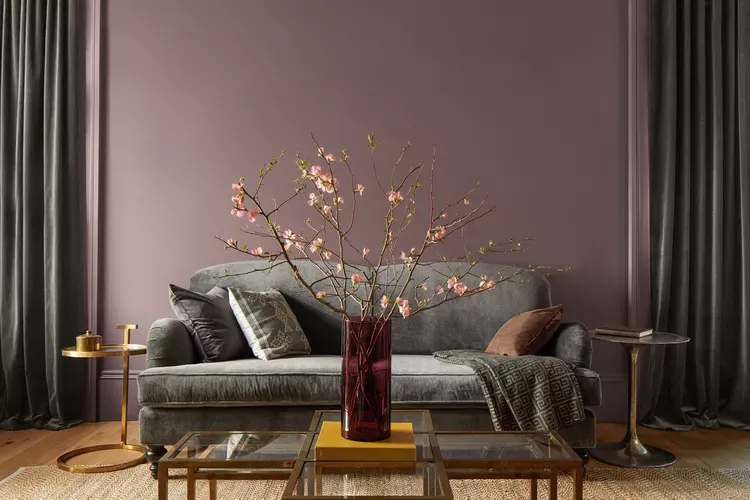
Photo: Benjamin Moore Cinnamon Slate
9. Cinnamon Slate 2113-40
No palette would be complete without Benjamin Moore’s Color of the Year for 2025: Cinnamon Slate . This color is described as a delicate mix of heather plum and velvety brown, making it a standout choice in the collection. Yeo notes that Cinnamon Slate can appear brown, plum, or even gray depending on the surrounding colors and lighting, offering incredible versatility as a neutral.
The dual undertones—both blue and red—allow it to pair beautifully with a wide range of colors, making it suitable for various home styles. Whether used in a contemporary setting or a traditional space, Cinnamon Slate adds depth and richness, creating an inviting atmosphere.
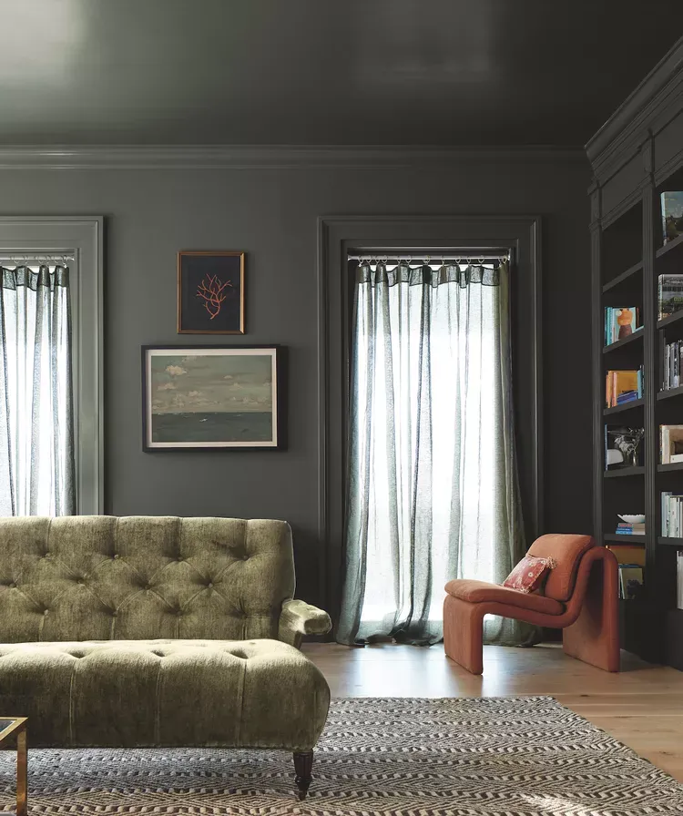
Photo: Benjamin Moore Ashwood Moss
10. Ashwood Moss 1484
Ashwood Moss is a favorite among the Benjamin Moore team for its deep saturation and sophisticated appearance. This hue can appear as a rich forest green or take on a grayish tone, depending on its surroundings. Yeo explains that its deep saturation makes it a solid alternative to black, adding an air of elegance and comfort to any space.
When a room is drenched in Ashwood Moss, it evokes feelings of richness and coziness, making it perfect for intimate spaces like bedrooms or reading nooks. It can also be used in millwork and built-ins, creating a cohesive look that ties together different elements of the home.
Putting It All Together: How to Use the 2025 Color Trends Palette
As you consider how to incorporate these colors into your own home, it’s essential to remember that the beauty of the 2025 Color Trends Palette lies in its versatility and harmony. Each color can stand alone, but they also work wonderfully together, allowing for endless combinations and creative possibilities.
Accent Walls: Consider using bolder shades like Rosepine or Cinnamon Slate as an accent wall in a living room or bedroom. This creates a focal point that draws the eye while allowing softer colors to balance the overall look.
Layering Colors: Use complementary shades throughout your home to create a cohesive design. For instance, pair Paris Rain with Glacier White for a fresh, airy feel, or combine Ashwood Moss with Leather Saddle Brown for a rich, earthy palette.
Mixing Textures: To elevate your design, think about incorporating different textures alongside these colors. For example, a Stained Glass accent paired with natural wood tones can create a warm and inviting space.
Seasonal Adjustments: The flexibility of these colors means they can adapt with the seasons. Consider switching out decor, textiles, or art pieces to complement the colors as the year progresses, allowing your space to feel fresh and relevant throughout the year.
Furniture and Decor: When selecting furniture and decor, look for pieces that echo the tones in the palette. Soft furnishings in Tissue Pink or warm browns can enhance the overall warmth and comfort of your space.
As we move into 2025, Benjamin Moore’s Color Trends Palette invites us to embrace comfort, warmth, and familiarity in our living spaces. The colors selected reflect a longing for connection, a desire for homes that not only look beautiful but also feel inviting and nurturing. By incorporating these shades into your design choices, you can create a space that resonates with both style and comfort.
So whether you’re repainting a room, updating decor, or planning a complete home renovation, these colors provide a foundation for creating a cozy and beautiful environment. Embrace the palette, let your creativity flow, and transform your home into a sanctuary that speaks to your heart.