Alfresco living is more than just a trend; it’s a way to enhance your lifestyle by bringing the comforts of your indoor space into the open air. Whether you have a cozy porch, an expansive patio, or a luxurious pool deck, the right paint colors can transform these outdoor areas into personal retreats filled with style and serenity.
By carefully selecting and coordinating colors, you can create a cohesive look that not only reflects your personal taste but also complements the natural beauty of your surroundings.
In this guide, we’ll explore top Benjamin Moore paint color picks for porches, patios, and pool decks, offering ideas and inspiration to help you create a welcoming and relaxing environment. Whether you prefer soothing neutrals, vibrant hues, or something in between, these curated color schemes will help you elevate your outdoor spaces to new levels of comfort and sophistication.
Inspiring Porch Paint Ideas
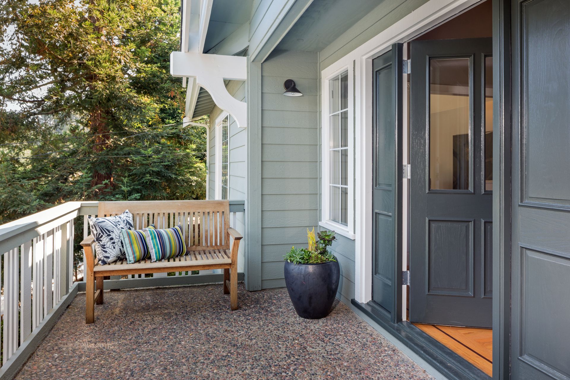
Your porch is often the first impression visitors have of your home, and it serves as the gateway between your indoor and outdoor living spaces. It’s not just a transitional area; it’s an extension of your home where you can relax, entertain guests, or simply enjoy a quiet moment. To make the most of your porch, it’s essential to choose paint colors that set the right tone—whether that’s calm and serene or vibrant and welcoming.
One timeless approach to porch painting is to use colors inspired by nature. For example, Cloud Cover OC-25 is a soft off-white shade with subtle gray-blue undertones, perfect for creating a soothing and elegant look. This color works beautifully on siding, columns, and doors, creating a cohesive and polished appearance. Pair it with Oxford Brown ES-67 , a deep and grounding brown, on the deck, stairs, and railing to add contrast and depth.
If you want to strengthen the connection between your indoor and outdoor spaces, consider drawing inspiration from the surrounding landscape. Colors like Fernwood Green 2145-40 , Warm undertones infuse this leafy green with calming comfort, and Tranquility AF-490 , a muted blue-green, echo the hues of trees and sky, bringing the outdoors in. Another great option is Soleil AF-330 , a yellow that paints the picture of bright, golden rays peeking through fluffy clouds
How to Choose a Stain for Your Porch
While paint is a great option for many porch surfaces, don’t overlook the beauty and durability of wood stain. A fresh coat of stain can enhance the natural beauty of wood while providing protection from the elements. When choosing a stain, consider both the opacity and color, as these factors will determine the overall look of your porch.
Benjamin Moore Woodluxe® offers a range of oil- and water-based exterior stains that are perfect for porches, decks, and other outdoor wood surfaces. For a warm and inviting look, consider Natural Cedartone ES-45 , a rich brown that enhances the wood’s natural grain. Pair it with White Heron OC-57 on the trim and soffit for a classic, clean appearance that complements any style of home.
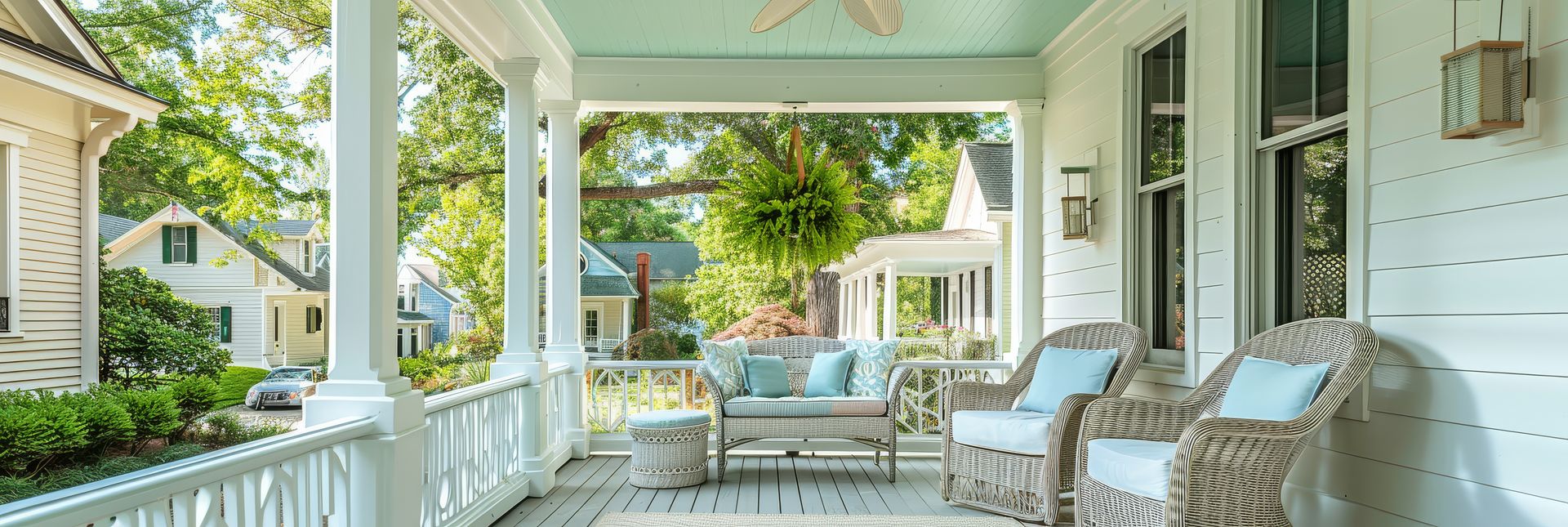
The Beauty of a Light Blue Ceiling
A light blue ceiling is a charming and traditional porch paint idea that’s particularly popular in the southern United States, though it’s made its way north over time. The tradition of painting porch ceilings blue was originally started in the Southern United States by the Gullah people who believed that ghosts (known as “haints”, pronounced ‘haunts’) were not able to cross water and by painting one’s ceiling blue, they would be able to keep the haints away from the house (there are even colors in certain paint manufacturer palettes called ‘haint blue’!)
The color is also believed to ward off insects The theory was that the insects would mistake the blue ceiling for the sky and decide to set up camp elsewhere, essentially serving as easy pest control against potentially annoying nuisances.
Years ago, probably unbeknownst to most folks at the time, paint was often mixed with lye – a natural insecticide – therefore any paint (regardless of color) with lye in it would serve to ward off the insects.
Nonetheless, the tradition of the sky blue porch ceiling had begun, lasts to this day, and you would be very hard-pressed to find any insects building homes within the area of a blue porch ceiling.
To achieve this look, consider using White Satin 2067-70 , A cool, soothing powder blue with a whisper of lilac that pairs beautifully with White Dove OC-17 for the trim and walls. The contrast between the blue ceiling and white walls draws the eye upward and gives the porch a spacious, airy feel. Other blue shades to consider for this look include Arctic Blue 2050-60 , Yarmouth Blue HC-150 , and Clear Skies 2054-70.
Consider Sunlight and Lighting
When selecting paint colors for your porch, it’s crucial to consider how much sunlight the space receives throughout the day. Sunlight can dramatically alter the appearance of paint colors, making them appear warmer or cooler depending on the time of day and the direction your home faces.
Before making a final decision, test paint samples on different parts of your porch and observe how they look in various lighting conditions. This step will help you avoid surprises and ensure that the color you choose is exactly what you envisioned.
Pairing Furniture with Porch Paint Colors
Your porch furniture plays a significant role in the overall aesthetic of the space, and coordinating it with your paint colors can elevate the design to new heights. For a whimsical touch, consider using varying shades of green against a neutral backdrop. For example, Raccoon Fur 2126-20 , a light black with a hint of inky violet, creates a striking contrast with bright green cushions and accessories.
Here are a few porch color combinations to consider:
Salamander 2050-10 with Georgia Peach 031: A bold green paired with a soft peach creates a vibrant and inviting space. Crystalline AF-485 with Wenge AF-180 : A pale, airy blue with a rich, dark brown for a sophisticated look. Buttered Yam AF-230 with Solitude AF-545 : A warm orange paired with a calming blue for a balanced and lively porch. 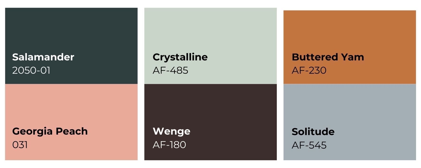
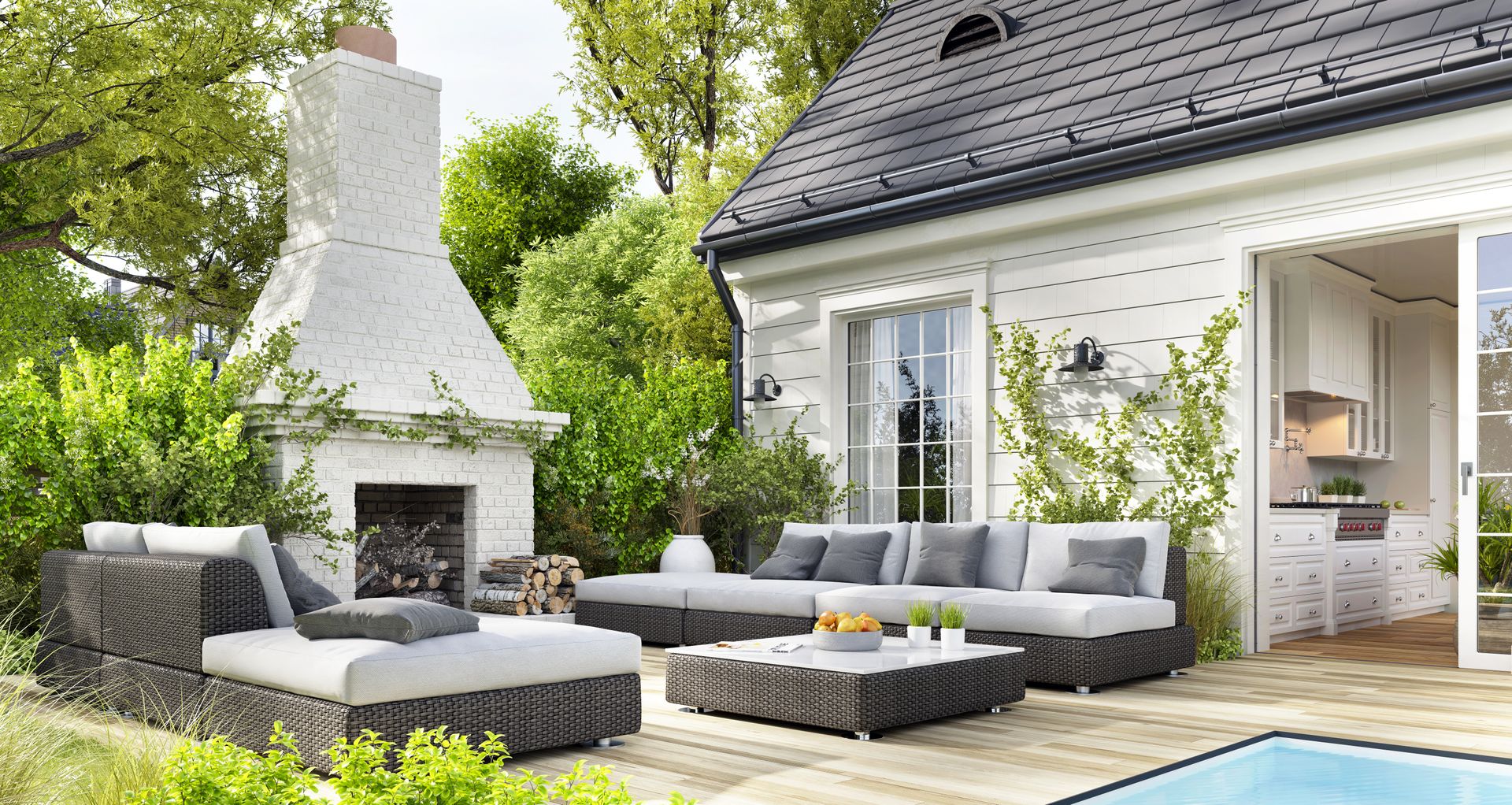
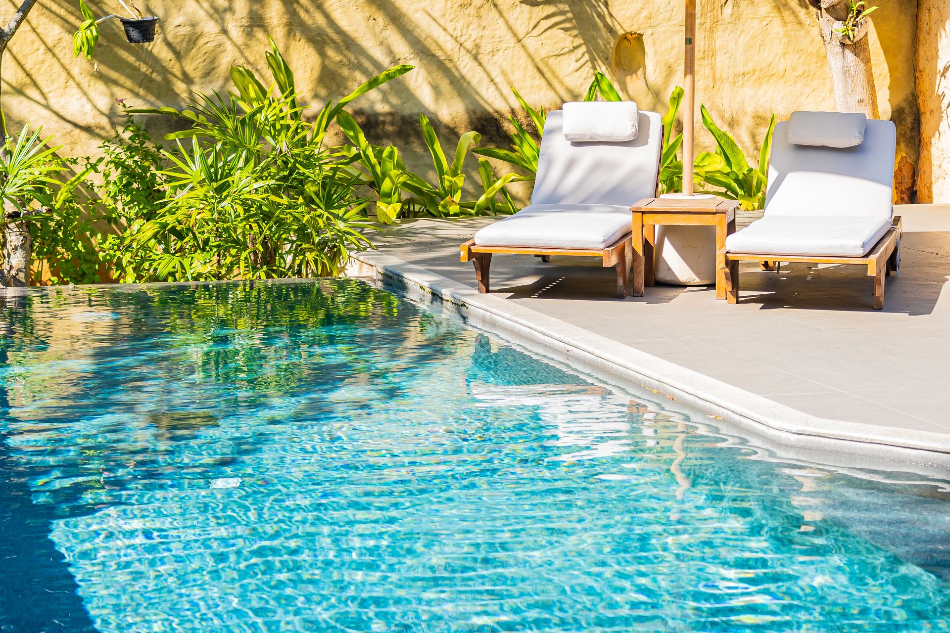
Best Patio Paint Colors
Your patio is an outdoor extension of your home, providing a space for dining, entertaining, and relaxation. Just like any other room in your house, the patio benefits from a thoughtful color scheme that complements your home’s architecture and natural surroundings.
Extend Your Interior Outdoors
One of the most effective ways to create a harmonious outdoor space is to extend your interior color palette to the patio. This approach creates a seamless transition between indoor and outdoor living areas, making your home feel more expansive and cohesive.
Consider painting exterior walls in a color that complements your interior design, like Queen’s Wreath 1426 , a smoky plum with a mystical quality. This color can serve as a focal point, especially when used on a chimney or accent wall. Pair it with Pure White OC-64 on the surrounding surfaces for a clean, modern look.
Here are some other patio paint colors to try:
Blue Nova 825 : A deep, moody blue that adds depth and sophistication. Carter Plum CW-355 : A rich, bold plum that makes a statement. Wasabi AF-430 : A fresh, vibrant green that adds a pop of color and energy.
Off-White Patio Paint Colors
Off-white is a versatile and timeless choice for patio paint, offering a natural, understated elegance. These shades work particularly well when paired with stone pavers or natural wood elements, creating a look that is both classic and contemporary.
Some of our favorite off-white patio colors include:
Evening White OC-81 : A soft, warm white that’s perfect for creating a serene and welcoming patio. Classic Gray OC-23 : A light, neutral gray that pairs beautifully with a wide range of colors. Cedar Key OC-16 : A warm, taupe-tinged off-white that adds a touch of coziness.
Patio Accent Colors
Accent colors can bring your patio to life, adding personality and flair to the space. When choosing an accent color, look to nature for inspiration. Sky blues, sunny yellows, and earthy tones can all make beautiful accents that enhance your outdoor environment.
Consider using Jet Stream 814 , a buoyant sky blue, on shutters or outdoor furniture for a refreshing pop of color. Hawthorne Yellow HC-4 is another great option, adding warmth and a welcoming touch to any patio.
Additional accent color ideas:
Milk and Honey AF-210 : An earthy, artsy apricot for the color-confident. Sonoma Clay 1242 : An earthy, soft red-violet with an intriguing, soothing quality Rosepine 461 : A muted moss green that verges on a dark taupe.
Patio Accent Colors
Accent colors can bring your patio to life, adding personality and flair to the space. When choosing an accent color, look to nature for inspiration. Sky blues, sunny yellows, and earthy tones can all make beautiful accents that enhance your outdoor environment.
Consider using Jet Stream 814, a buoyant sky blue, on shutters or outdoor furniture for a refreshing pop of color. Hawthorne Yellow HC-4 is another great option, adding warmth and a welcoming touch to any patio.
Additional accent color ideas:
Milk and Honey AF-210: A soft, creamy yellow that adds a touch of warmth. Sonoma Clay 1242: An earthy, terracotta hue that brings a natural, grounded feel. Rosepine 461: A muted, rosy pink that adds a subtle, sophisticated touch.
Creating Your Outdoor Oasis
Transforming your porch, patio, or pool deck with the right paint colors is more than just a cosmetic upgrade—it’s about crafting an environment that enhances your lifestyle and enriches your daily experiences. These outdoor spaces serve as extensions of your home, offering a sanctuary where you can unwind after a long day, host gatherings with friends and family, or simply enjoy a quiet moment immersed in nature. By thoughtfully selecting paint colors that resonate with your personal style and harmonize with your home’s architectural features, you can blur the lines between indoor and outdoor living, creating a seamless flow that enhances the overall aesthetic of your property.
When choosing colors, it’s important to consider the mood and atmosphere you want to create. Serene neutrals can evoke a sense of calm and tranquility, perfect for a cozy porch where you sip your morning coffee or relax with a good book. Bold accents, on the other hand, can inject energy and personality into your patio, making it a vibrant space for entertaining guests or enjoying lively family dinners under the stars. Classic shades offer timeless elegance, ensuring that your outdoor space remains stylish and inviting for years to come.
Beyond aesthetics, the right paint colors can also influence the way you interact with your outdoor spaces. Light, airy hues can make smaller areas feel more expansive and open, while darker, richer tones can add warmth and intimacy to larger, more exposed spaces. Additionally, the interplay of colors with natural light can create dynamic visual effects that change throughout the day, adding depth and interest to your outdoor oasis.
With careful planning and a little creativity, you can curate an outdoor environment that not only reflects your taste but also enhances the functionality of the space. Whether you envision a tranquil retreat or a lively social hub, the possibilities are endless when it comes to transforming your outdoor areas into a true haven. Embrace the opportunity to personalize your space, experiment with color combinations, and create a cohesive design that brings your vision to life. In doing so, you’ll not only elevate the beauty of your home but also create a space that invites relaxation, fosters connection, and celebrates the joys of alfresco living.