Choosing a color palette for your home is a rewarding endeavor that sets the tone for the entire space. A well-thought-out color palette can tie all the elements of your home together, making it feel cohesive, visually appealing, and professionally designed.
Whether you’re redecorating a single room or planning a full renovation, establishing a whole-house color palette can help you achieve a sense of harmony throughout your living space. This guide will take you through the steps to create a unified color scheme that enhances your home’s aesthetic appeal and brings the atmosphere you desire.
Why Opt for a Whole-House Color Palette?
Creating a whole-house color palette has numerous advantages. Here are just a few:
Cohesion and Flow: A whole-house color palette ensures that each room flows seamlessly into the next. Your home will feel more unified rather than a series of disconnected spaces.
Simplified Decision-Making: Once you’ve established a color scheme, many decisions become easier. Choosing furniture, decor, and even textiles will be simpler when you’re working within a set range of colors.
Aesthetic Appeal: A home designed with a unified color palette looks more intentional and professionally designed. It also allows you to make bold choices without overwhelming the space since the colors will be tied together with your foundation palette.
Increased Resale Value: When selling a home, neutral, cohesive color schemes tend to appeal to a broader audience. A whole-house palette that complements the architectural features of your home can increase its resale value.
How to Choose a Whole-House Color Palette
1. Define Your Goals and Desired Atmosphere
Before you start choosing colors, take a moment to think about what kind of energy or atmosphere you want your home to convey. Different colors can evoke different emotions and moods:
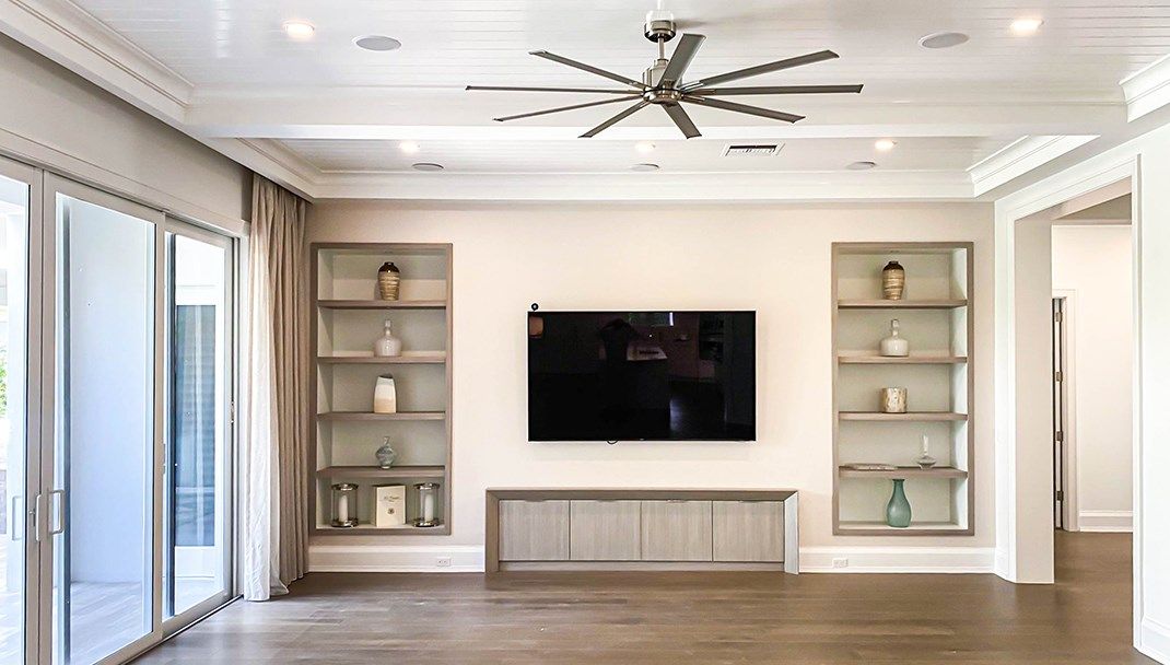
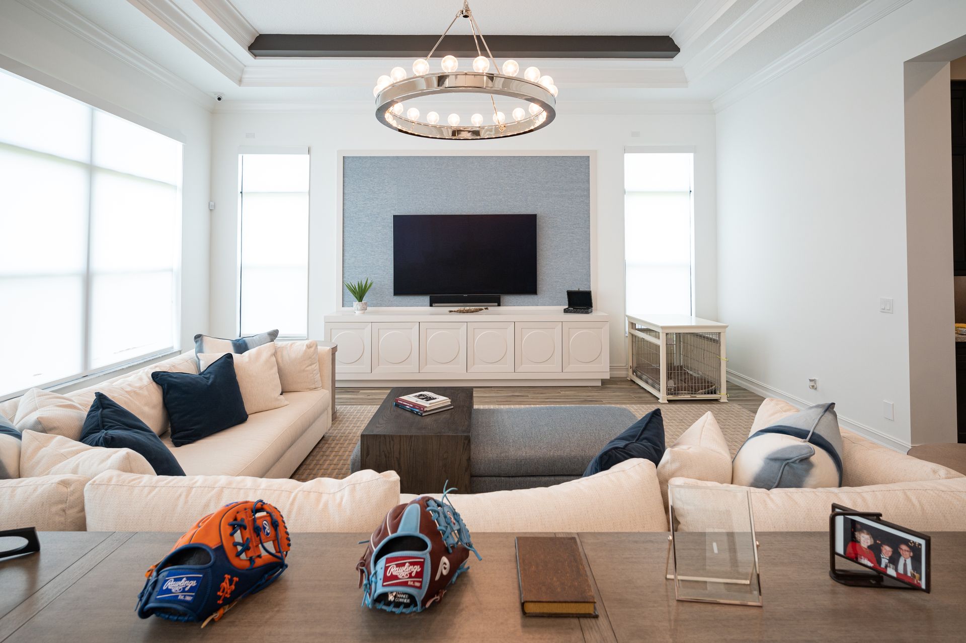
Neutral and Calming: If you’re seeking a peaceful, tranquil space, opt for neutrals like soft grays, whites, beiges, and muted earth tones. These colors help create a serene environment perfect for relaxation.
Vibrant and Energetic: For a lively, energetic vibe, consider adding bold hues like vibrant greens, deep blues, or rich reds. These colors can be great for social spaces like kitchens or living rooms, where you want to encourage interaction and movement.
Warm and Inviting: If you’re aiming for a cozy, welcoming feel, opt for warm tones like taupe, cream, golden yellows, or terracotta. These colors can make spaces feel intimate and inviting.
Modern and Sleek: To create a more modern or contemporary vibe, use cooler tones like steel gray, navy, or crisp white paired with contrasting black or metallic accents.
If you’re struggling to visualize what you want, consider consulting with an interior painting professional like Tru Colors Contracting who can help translate your goals into a practical color palette. Some painting services also offer virtual color consultations where they use software to help you visualize how certain colors will look in your space.
2. Use Your Home’s Hard Finishes as a Starting Point
The first rule when choosing a color palette for your home is to consider the elements that won’t be changing. Hard finishes such as flooring, countertops, tile work, and cabinetry are much more expensive to replace than paint. They should serve as a guide for your color selections:
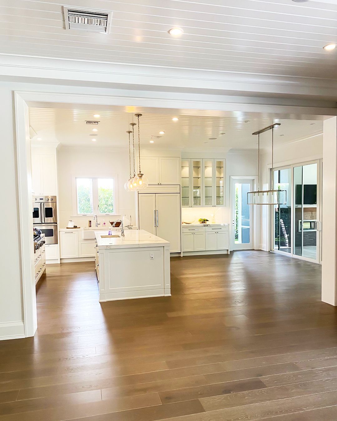
Flooring: Whether you have hardwood, tile, or carpet, the flooring color can either complement or contrast with your wall colors. For example, dark wood floors may look stunning paired with lighter wall colors, while neutral tile floors provide a versatile base for nearly any wall color.
Countertops: In spaces like kitchens and bathrooms, countertops are a dominant visual element. Marble, granite, or quartz countertops with unique veining can offer color inspiration for your palette. Look for undertones in your countertops and match them with paint colors.
Cabinetry and Trim: If you’re not planning to repaint or replace your cabinetry, consider their existing color or wood tone. Dark cabinetry often pairs best with lighter wall colors, while lighter cabinetry allows for more vibrant or deeper hues on the walls.
3. Select a Trim and Ceiling Color First
Before diving into the wall colors, choose your trim and ceiling color. While many homeowners opt for white trim, there are several options to explore:
Classic White Trim: A safe and timeless choice, white trim provides a crisp, clean contrast to wall colors and gives your home a polished look.
Neutral or Colored Trim: If you want something a bit more unique, you can opt for off-white, cream, or even darker tones like gray or charcoal for your trim. Colored trim can add an unexpected layer of sophistication to your color scheme.
Ceiling Colors: In most cases, a simple white ceiling is the way to go, as it helps reflect light and makes the room feel more spacious. However, you can also experiment with soft hues if you’re aiming for a more custom look.
4. Pick a Foundation Color for Main Living Areas
Your main living area serves as the hub of your home, so it’s important to select a foundational color that sets the tone. This color will likely be used in several of the most visible areas of your home, such as the living room, dining room, and hallways. Here are a few tips for selecting this foundational hue:
Neutral Foundations: Colors like warm beiges, greiges (a blend of gray and beige), or soft grays work well as a base color because they are versatile and can complement various other hues. Neutrals are also more likely to appeal to future buyers if you plan to sell your home.
Light Colors for Smaller Spaces: If your home is on the smaller side or you want to make it feel more open, opt for lighter tones. These colors help reflect light and create an illusion of space.
Soft Earth Tones: Shades like muted greens or soft blues are perfect for creating a calm, nature-inspired environment. They bring a touch of color without overpowering the room.
5. Coordinate Bedrooms and Secondary Rooms
Once you’ve established the main color for your living areas, it’s time to select colors for more private spaces, like bedrooms and secondary living areas. Here’s how you can approach it:
Analogous Colors: This involves using colors that are next to each other on the color wheel. For example, if your foundation color is a soft gray, you can pair it with a soft blue or pale green for the bedrooms.
Complementary Colors: This approach uses colors from opposite sides of the color wheel. For example, pairing warm, neutral tones with cool blues can create a balanced and inviting feel.
Personalization: Bedrooms can reflect more personal tastes, so don’t hesitate to let family members choose their favorite colors. However, it’s a good idea to keep the tones consistent with the overall palette to maintain a sense of unity.
6. Incorporate Accent Walls and Decorative Details
Accent walls can add dimension and interest to your rooms without overwhelming the space. Since you’ve already established a cohesive palette, choosing accent wall colors becomes simpler. Here are a few ideas:
Darker Shades: Use slightly darker shades of your primary color on accent walls to create depth and drama. For example, if your main walls are light gray, a charcoal accent wall can be both striking and cohesive.
Textures and Finishes: You can also experiment with different textures or paint finishes on accent walls. Matte finishes can add a subtle contrast to glossy walls, while textured paints or wallpapers can create a focal point.
Frequently Asked Questions About Whole-House Color Palettes
How many colors should be in a whole-house palette? A typical whole-house color palette consists of five to seven colors. This includes your foundation color, secondary colors for bedrooms or bathrooms, and accent colors for specific features like trim or accent walls. Larger homes can incorporate up to ten colors, while smaller spaces may work best with just four or five to avoid feeling cluttered.
Should the entire house have the same color scheme? While the entire house doesn’t need to be painted the same color, maintaining a consistent palette helps create visual unity. Avoid using the same color on every wall, as this can make the home feel monotonous. Instead, choose complementary shades and accents to add variety while staying within the overarching color scheme.
Designing a whole-house color palette is about finding a balance between personal style and a sense of harmony throughout your home. By carefully considering your goals, the elements that won’t change, and how colors interact in different spaces, you can create a beautiful, cohesive look that enhances the experience of your home. Whether you’re revamping your living room, adding color to bedrooms, or selecting accent walls, a unified color palette will make your home feel complete, welcoming, and well-designed.
Considering a new whole-house color palette? Contact Us at Tru Colors Contracting today to discuss your project!