Sherwin-Williams has named Creamy (SW 7012) its January 2025 Color of the Month, setting the stage for a year filled with timeless, versatile design. Creamy is an off-white hue with delicate yellow undertones, offering the perfect balance of warmth and brightness. Its subtle sophistication makes it a favorite for homeowners and interior designers looking to refresh their spaces without feeling over-designed.
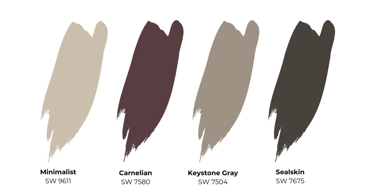
In this blog, we’ll explore why Creamy is the ideal choice for your home, delve into design inspirations, and highlight complementary colors like Minimalist (SW 9611), Keystone Gray (SW 7504), Carnelian (SW 7580), and Sealskin (SW 7675) to help you create harmonious, eye-catching spaces.
The Allure of Creamy: Why It’s Perfect for 2025
Neutral paint colors never go out of style, and Creamy is no exception. With its ability to adapt to various design aesthetics, this color is both timeless and trendy.
Here’s what makes Creamy stand out:
- Soft Warmth: The delicate yellow undertones add subtle warmth, making spaces feel cozy yet sophisticated.
- Versatility: Creamy pairs effortlessly with bold, muted, and neutral shades, making it suitable for any design scheme.
- Timeless Elegance: Its understated charm ensures it remains relevant, even as design trends evolve.
Design Inspirations with Creamy
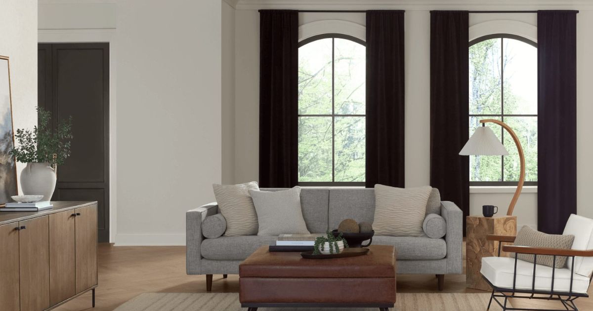
1. Living Room Harmony
Creamy creates a warm, inviting atmosphere in living rooms, making it perfect for relaxing and entertaining. Pair it with Keystone Gray (SW 7504) for a grounded, earthy feel. Add accents in Carnelian (SW 7580) through pillows, artwork, or rugs to introduce a rich, dramatic touch. To complete the look, use natural materials like wood and linen for texture.
2. Bedroom Tranquility
Transform your bedroom into a serene retreat by using Creamy as the wall color. Complement it with Minimalist (SW 9611) for a soft, modern vibe. For depth, incorporate Sealskin (SW 7675) in furniture or accessories like upholstered headboards or curtains. The result is a cozy yet contemporary space perfect for unwinding.
3. Kitchen Sophistication
In the kitchen, Creamy works beautifully for walls or cabinetry, offering a clean yet warm aesthetic. Pair it with Keystone Gray (SW 7504) on an accent wall or island to create a striking contrast. Add metallic finishes like brushed gold or matte black in hardware and lighting for a touch of luxury.
4. Bathroom Elegance
For a spa-like bathroom, use Creamy on the walls and complement it with Minimalist (SW 9611) for trims and accents. Add pops of Carnelian (SW 7580) through accessories like towels or artwork to create a unique yet harmonious palette.
Using Complementary Colors with Creamy
Minimalist (SW 9611): Subtle Sophistication
Minimalist is a light neutral that pairs seamlessly with Creamy to create a serene, understated aesthetic. Its cool undertones balance the warmth of Creamy, making it ideal for modern, minimalist designs. Use this pairing in spaces like bedrooms, bathrooms, or offices for a clean and calming environment.
Keystone Gray (SW 7504): Earthy Depth
Keystone Gray is a rich, taupe-based neutral that adds depth and character to any space. When paired with Creamy, it creates a grounded yet elegant look. Use Keystone Gray on accent walls, cabinetry, or furniture to add dimension to living rooms or kitchens.
Carnelian (SW 7580): Bold Drama
Carnelian, a deep and rich red, provides a striking contrast to Creamy’s softness. This pairing works well in accent pieces such as throw pillows, rugs, or statement furniture. For those who love a bolder design, consider using Carnelian on a feature wall to make a dramatic statement.
Sealskin (SW 7675): Modern Contrast
Sealskin is a deep, dark neutral that adds sophistication and contrast to Creamy. This pairing is ideal for creating a modern, high-contrast design. Use Sealskin for furniture, trim, or even doors to achieve a polished, contemporary look.
Where to Use Creamy in Your Home
Open Floor Plans
In open-concept spaces, Creamy provides a cohesive foundation that ties together different areas while allowing flexibility for accent colors. Pair it with Keystone Gray in the dining area, Minimalist in hallways, and Sealskin on statement furniture to create a dynamic yet harmonious look.
Accent Walls
Although Creamy is a neutral, it can still be the star of the show when used on an accent wall. Add depth by pairing it with bold artwork or a gallery wall. For contrast, paint adjacent walls in Keystone Gray or Minimalist.
Ceilings and Trim
Break away from traditional white ceilings and trims by using Creamy instead. Its subtle warmth elevates the overall look of a room without overwhelming the space. Complement with Sealskin for doors or Keystone Gray for crown moldings to add a touch of sophistication.
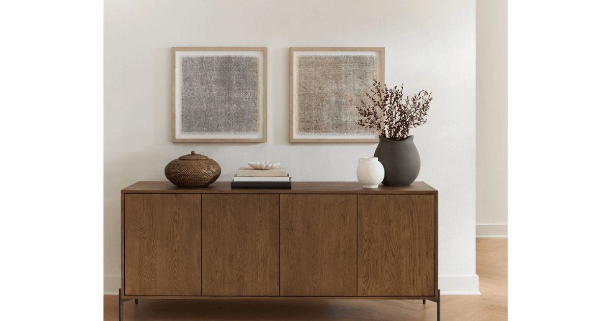
Furniture and Decor
Creamy isn’t just for walls—use it on furniture like dressers, side tables, or bookshelves. Add accent pieces in Carnelian or Sealskin for a visually interesting contrast.
Practical Tips for Painting with Creamy
- Test in Different Lighting: Like all paints, Creamy’s appearance changes based on lighting conditions. Test it in natural and artificial light to ensure it suits your space.
- Choose the Right Finish: For walls, opt for satin or eggshell finishes. Use semi-gloss for trims and cabinetry to highlight architectural details.
- Layer with Textures: Enhance Creamy’s warmth with textiles like wool rugs, velvet throw pillows, or linen curtains. These textures add depth and visual interest to your space.
- Combine with Natural Materials: Creamy pairs beautifully with natural materials like wood, rattan, or stone, making it a perfect choice for organic-inspired interiors.
Creamy in Different Design Styles
Modern Farmhouse
Creamy is a natural fit for the modern farmhouse aesthetic. Pair it with shiplap walls, exposed beams, and accents in Keystone Gray. Use Sealskin for hardware and fixtures to complete the look.
Mid-Century Modern
For a mid-century modern vibe, combine Creamy with clean lines, geometric patterns, and pops of Carnelian. Add Minimalist to soften the overall palette and create a balanced design.
Traditional Elegance
In traditional designs, Creamy shines when paired with rich wood tones and classic furniture. Add Keystone Gray or Sealskin to trims and moldings for a timeless, elegant look.
The Timeless Appeal of Creamy
Sherwin-Williams’ January 2025 Color of the Month, Creamy, encapsulates the essence of versatility and warmth. Its ability to pair with a wide range of colors, from soft neutrals like Minimalist to bold shades like Carnelian, makes it a go-to choice for any design style.
Whether you’re looking to refresh a single room or transform your entire home, Creamy provides the perfect foundation. Its timeless elegance, combined with complementary colors like Keystone Gray and Sealskin, allows you to create spaces that feel both welcoming and sophisticated.
As we embrace the new year, let Creamy inspire your home transformations. This warm, inviting neutral offers endless design possibilities, from creating serene living spaces to bold, modern contrasts. With the right complementary colors and thoughtful design choices, Creamy can help you achieve a look that is both stylish and timeless.
Ready to Start Your Painting Project?
Transform Your Space with Tru Colors Contracting
When it comes to painting your home or business, Tru Colors Contracting stands out as a premier choice for quality and professionalism. Specializing in both residential and commercial painting services across South Florida and the Treasure Coast, Tru Colors Contracting offers expertise in:
- Interior and Exterior Painting: Whether you’re refreshing your living room or giving your office building a facelift, Tru Colors Contracting delivers impeccable results.
- Custom Color Consultation: Need help choosing the perfect shade? Tru Colors Contracting provides expert color consultation to ensure your vision comes to life.
- Surface Preparation and Repair: From stucco repairs to pressure washing, our team ensures surfaces are prepped meticulously for a flawless finish.
- Quality Assurance: With a commitment to using top-quality paints and materials, we guarantee durability and lasting beauty for your painted surfaces.
Transform your space with confidence. Contact Tru Colors Contracting today to discuss your painting project and experience the difference professionalism makes.