
Golden light streaming through rustling leaves, the buttery scent of pecan pie, and the coziness of your favorite knit throw: fall fills our senses and kindles a sense of comfort and nostalgia. As the season shifts, many of us feel inspired to bring that cozy ambiance into our homes.
Benjamin Moore’s curated fall palette lets you do just that, with seven stunning paint colors inspired by autumn’s timeless beauty and versatility.
Benjamin Moore color and design experts have selected these hues not only for their autumnal warmth but for their ability to provide a sense of year-round comfort. From earthy tones that ground a space to ethereal grays that add a light, airy feel, this palette has a bit of everything to help you craft a welcoming, refined aesthetic. Here’s a complete guide to each shade, with tips on color pairings, room-specific applications, and decor ideas to help you make the most of this season’s hues all year long.
The Benjamin Moore Fall Color Palette: Embracing the Timelessness of Autumn
Each of the following colors brings its own unique character to a space. They’re designed to harmonize together, making it easy to mix and match within a single room or from one room to another for a cohesive flow throughout your home.
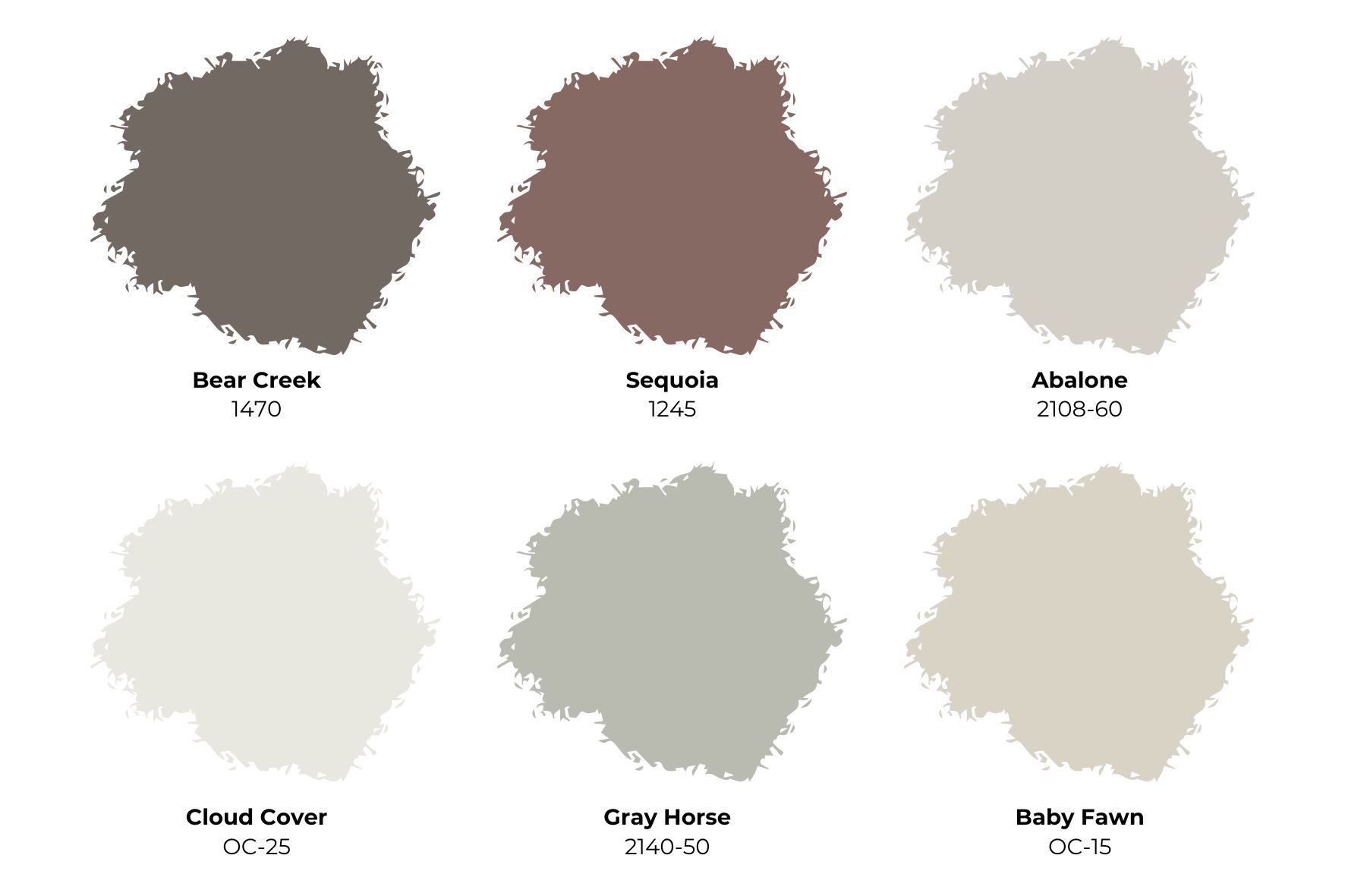
1. Bear Creek 1470 – Bringing the Outdoors In
The essence of nature captured in a deep, rich grayish-brown, Bear Creek is a color that instantly adds warmth and coziness to any space. Its grounding tones are reminiscent of the bark of a tree or the earthy trails in the woods, making it the perfect hue for creating a sanctuary-like feel indoors. Bear Creek stands out as a beautiful backdrop in living rooms, dens, or reading nooks, where its dark tones add depth without overwhelming the space.
Perfect Pairings: Pair Bear Creek with trims and ceilings in soft off-whites like Cloud White OC-130 or Swiss Coffee OC-45 . The contrast offers a sophisticated edge that frames Bear Creek’s depth. Styling Tips: This hue pairs beautifully with rustic accents—think a weathered leather chair, wooden bookshelves, or a plush wool rug. Adding a few indoor plants, such as ferns or a fiddle-leaf fig, can bring out Bear Creek’s organic feel, enhancing the natural vibes of the room. Versatility: Bear Creek’s rich tone is part of the Benjamin Moore Classics® collection, a selection of colors that stand the test of time. Use it in both traditional and modern spaces to create a look that is always in style.
2. Sequoia 1245 – A Dusty, Versatile Red
Sequoia brings a muted, reddish-brown warmth that feels like a modern take on traditional burgundy. With just the right touch of dynamic color intensity, Sequoia offers a versatile style that goes beyond the usual rich autumn tones, making it a standout choice for accent walls, powder rooms, or even dining areas. It can act as a bold statement color or blend into a more subdued, harmonious palette.
Perfect Pairings: For trim, opt for soft whites like White Dove OC-17 , White Opulence OC-69 , or Simply White OC-117 . These colors highlight Sequoia’s warmth, adding balance to the overall look. Styling Tips: To highlight Sequoia’s warm sophistication, bring in brass fixtures or warm wood tones. A jute rug, vintage leather seating, or brass-framed mirrors elevate the space while keeping it cozy and inviting. Timeless Appeal: Part of the Benjamin Moore Classics® collection, Sequoia carries a timeless appeal that complements both traditional and contemporary interiors.

Image – Benjamin Moore
3. Abalone 2108-60 – The Beauty of Neutral Gray
A soft, versatile gray with a slight purple undertone, Abalone 2108-60 is a stunning choice for those who prefer neutrals with just a hint of warmth. It has enough beige to avoid feeling too cold, giving it a cozy, inviting vibe perfect for fall but adaptable for any season. Abalone is a fabulous choice for bedrooms, hallways, or as a backdrop in living rooms.
Perfect Pairings: To maintain Abalone’s soft look, pair it with Chantilly Lace OC-65 or Moonshine OC-56 on trim. The contrast adds dimension without overwhelming the room’s serene vibe. Styling Tips: Abalone works beautifully with natural textures. Incorporate linen curtains, a faux-fur throw, or wicker baskets for a layered, lived-in look that balances elegance and comfort. Enduring Appeal: Abalone’s neutrality and warmth make it an enduring choice that is as cozy in the winter as it is refreshing in the summer.
4. Cloud Cover OC-25 – An Effortless Off-White
As an airy, softly-shaded white, Cloud Cover OC-25 provides a refined backdrop for any color scheme, making it one of the most versatile off-whites available. It’s an excellent option for rooms that need a clean, bright feel, such as kitchens, bathrooms, or open living spaces. Cloud Cover adapts beautifully to seasonal decor changes, acting as a blank canvas for bold colors or subtle accents.
Perfect Pairings: Pair Cloud Cover with Chantilly Lace OC-65 or White Heron OC-57 for a seamless look. Alternatively, Moonshine OC-56 offers a slight contrast that brings out Cloud Cover’s warmth. Styling Tips: Keep the decor light and simple with natural textures like white ceramics, open shelving, and organic cotton linens. Cloud Cover also looks fabulous against dark wood furniture for an elegant contrast. Versatility for Every Season: Cloud Cover’s effortless beauty makes it a go-to for designers and DIYers alike. Use it throughout the home to tie rooms together with a consistent, calming aesthetic.
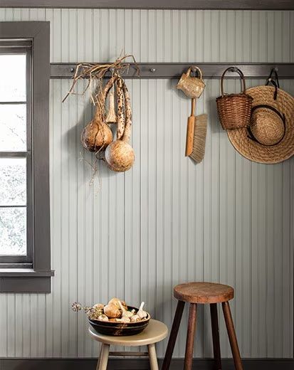
5. Gray Horse 2140-50 – Silvery-Green Serenity
For a subtle, soothing take on fall colors, Gray Horse 2140-50 brings a whisper of silvery green to your palette. It’s a wonderful choice for bedrooms or bathrooms where you want a calming, restful ambiance. Gray Horse has enough warmth to feel cozy yet light enough to keep the space open and airy.
Perfect Pairings: Complement Gray Horse with trim in Cloud Cover OC-25 or Winter White OC-21 for a cohesive, restful look. Styling Tips: Gray Horse pairs beautifully with metallics and glass accents. Try a silver-framed mirror or translucent vases to highlight its green undertones, adding an ethereal touch. Subtle Sophistication: Part of the Color Preview® collection, Gray Horse embodies timeless elegance that works across a variety of styles, from farmhouse to coastal.
6. Baby Fawn OC-15 – Soft Greige with a Cozy Feel
A serene greige, Baby Fawn OC-15 is perfect for creating a space that feels inviting and grounded. Its slightly pink undertone makes it a warm, neutral choice, suitable for bedrooms, living rooms, or any space where you want to foster calmness and comfort. Baby Fawn’s hue is reminiscent of a nature walk on a brisk fall morning.
Perfect Pairings: To complement Baby Fawn’s subtle beauty, try trim in White Dove OC-17 , Cloud White OC-130 , or Steam AF-15 from the Affinity® Color Collection. Styling Tips: Baby Fawn pairs well with natural woods, linen textures, and green plants. Use it in areas where you want to create a cozy nook, with a plush armchair or a layered bedspread. Adaptable Warmth: As part of the Off-White Collection, Baby Fawn’s soft tone adds familiarity and flexibility to any room.
Practical Applications: Room-by-Room Fall Color Inspirations
Living Room: A deeper shade like Bear Creek on an accent wall adds depth and coziness. Pair it with Baby Fawn on the remaining walls for a balanced, warm look. Accent the room with throws and pillows in Sequoia or Abalone to echo the palette’s warmth. Dining Room: Sequoia makes an excellent choice for a dining room where you want to create a warm, inviting environment. Pair with crisp trim in White Dove for an elevated look, and complement with dark wood furniture and brass fixtures. Bedroom: For a serene bedroom retreat, use Gray Horse on the walls and pair with light curtains in Cloud Cover. The soft, silvery-green tone is especially soothing and pairs well with neutral bedding in whites and grays. Kitchen: Baby Fawn brings a natural warmth to the kitchen, harmonizing with wood cabinets or open shelving. Add accents in Cloud Cover for trim or even as a cabinet color to brighten the space.
Creating Cohesion with Contrast and Texture
When working with a fall palette, textures are essential for achieving that cozy, layered look. Combine these colors with rustic wood, plush textiles, and metals like brass or bronze to add dimension. A velvet throw in Sequoia or woolen cushions in Abalone can add both color and comfort to a room.
Each hue in the Benjamin Moore fall palette is meant to resonate with the beauty of autumn but to transcend seasons, creating warmth and elegance that feel timeless. Let these colors wrap your space in comfort, and enjoy the warmth they bring all year long.
With this comprehensive guide, you can confidently bring the warmth and timeless elegance of autumn into your home. These Benjamin Moore shades are designed to celebrate fall’s beauty, and with a thoughtful touch, they’ll make your home feel inviting, polished, and cozy, season after season.
Ready to transform your space with one of Benjamin Moore’s Fall inspired colors? For a seamless, professional finish, Tru Colors Contracting can help bring these colors to life in your home. As experts in both residential and commercial painting , Tru Colors Contracting specializes in detailed preparation and precision application, ensuring that each hue is applied with perfect consistency. With our eye for design and commitment to quality, we’ll work with you to create a cohesive look tailored to your personal style, making your space feel refreshed, inviting, and on-trend with the latest in color design.
Contact Us today to discuss your project!