Paint swatches and chips have their place in the design process—but it may not be where you think. Everyone who has ever painted a room based on paint swatches or chips—and without the help of a professional designer—has a horror story about a choice that went wrong: Maybe it was a navy too dark for the dining room or a grassy green that looked almost neon on the wall.
Understanding the Limitations of Paint Swatches and Chips
While these mini shaded strips and squares have their uses, experts say they are not always the best way to find the right color for your room. Paint swatches can be a useful tool, but they shouldn’t be the only factor in your decision-making process. By understanding the drawbacks of paint swatches—and the benefits they can provide when used the right way—you can pick the perfect color every time.
3 Reasons Why Paint Swatches Aren’t Always Accurate
If you’ve ever been led astray by a paint swatch, you aren’t alone. Here’s why these strips don’t always produce the desired result: a one-to-one color match that translates from cardstock to wall.
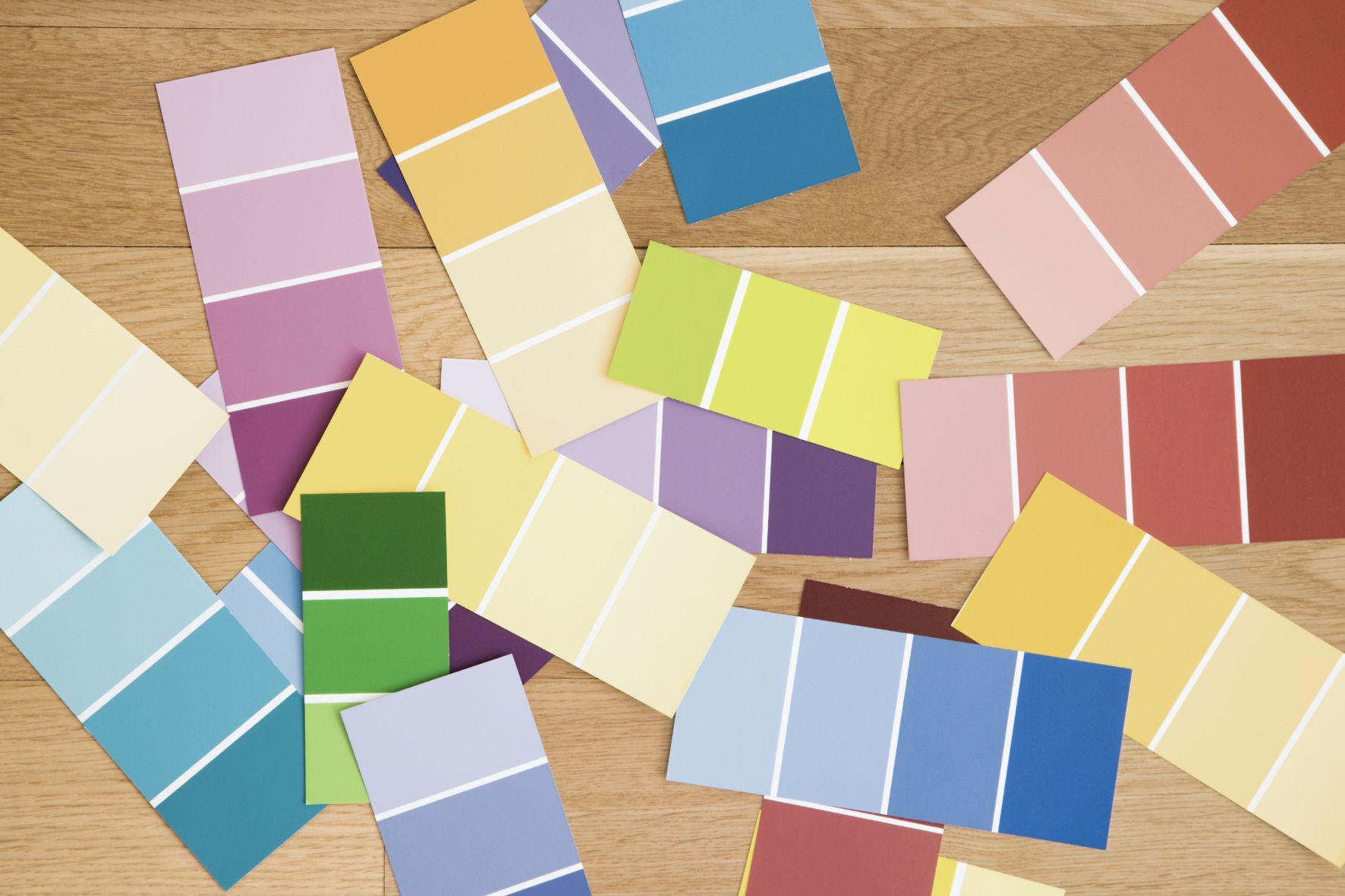
They Are Too Small
Paint swatches and chips’ small size is one obstacle to getting a true feel for the color. Traditional paint chips are tiny, so we rely on a 1-inch square to get a sense of what a color might look like in an entire room. Paint chips are a tiny little representation of the color so they are too small to allow someone to be able to envision what it would look like at a larger scale.
A shade you’re drawn to on a paint swatch may be too vivid or too dull for your taste when expanded from floor to ceiling, but the opposite is true, too: A color you find too bold or too boring on a chip can complement your space in unexpected ways. When it comes to visualizing the finished product, size matters.
Background Colors Trick the Eye
If you laid out all your swatches on a mahogany table, taped them up against a coat of white primer, or considered them next to an already-painted wall, you likely didn’t get an accurate read on the color. Holding rich colors next to light, bold next to subtle, or one shade against another can all trick your eye into seeing the chip slightly differently. This can be particularly nuanced with neutrals. If you’re trying to understand what a neutral looks like and your wall is blue, it is really not going to read as true. Since darker colors absorb light, it can be a bit less tricky—but they can also be impacted by the colors surrounding them.
Comparing all your chips on white isn’t a sure solution either. The eye tends to perceive colors as darker when placed against a white background, which can result in choosing a color that ends up being too light once the entire wall is painted.
The Rest of the Room Impacts the Color Swatch
While professional designers have honed their ability to look at a space holistically while sketching out an aesthetic, amateurs don’t always realize how a room’s other elements might affect a paint color. A dramatic rug, dark flooring, lots of natural light, or the color of your trim all play a role in how your room looks once finished, as your chosen paint color reflects or absorbs the colors around it. Even the landscaping outside your windows can cast a colored tinge on your wall, adding a pink glow when leaves turn red in the fall or a greenish tone when they unfurl in spring.
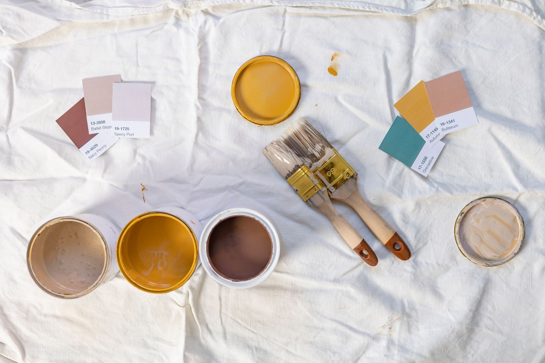
Use Paint Samples for a Better Color Match
Whether you hire a painter or DIY the job, you’re investing both time and money in the project—so you want to get it right the first time. That’s why opting for paint samples is the better choice. You could potentially get away with paint chips if you were going really simple—if you wanted a white and you weren’t too picky about the undertones. But, in particular with a more saturated color, it is important to test the color in your space, this is valuable to prevent in making costly mistakes.
Sample-sized jars of the custom colors you are considering allow you to paint larger sections of your wall, test paint in different parts of the room to see how the color changes with varying amounts of light, and compare several colors at once. Some homeowners find peel-and-stick paint samples a faster, easier, and neater way to test a paint color—but nothing will be as accurate as the actual paint.
Try an Online Visualizer
Using an online visualizer like Color Snap from Sherwin-Williams allows you to upload a photo of your room and “try on” different shades. These tools can provide a surprisingly accurate representation of how a color will look in your space and can be a useful way to preview different colors and narrow down your options before making a final decision.
However, if you’re previewing colors with online tools, on designer websites, or in images from your favorite design blogs, remember that everything from the photo filter to your screen settings can affect the shade. Your color will look different in the actual room; it’s crucial to get actual samples of paint color before committing. Although the technology and color rendition have improved significantly in recent years, colors can still look different online than they do in person. By getting physical samples, you can see the color in the context of your space and under different lighting conditions.
Using Paint Swatches Effectively
Though larger, on-the-wall paint samples offer the best success rate for choosing a color, smaller paint swatches do have their place in the design process.
Use Them to Narrow Down Your Shade Choices
When you start planning your room, paint swatches are an ideal way to narrow the field of shades you’re interested in: Are you leaning toward white or green for your neutral nursery, gray or terra cotta for your kitchen, hunter or cream for your office? Most people test three to five colors per room once they have landed on a color family. Sampling in and of itself is an investment, so a chip can help you narrow down which options you want to invest in sampling.
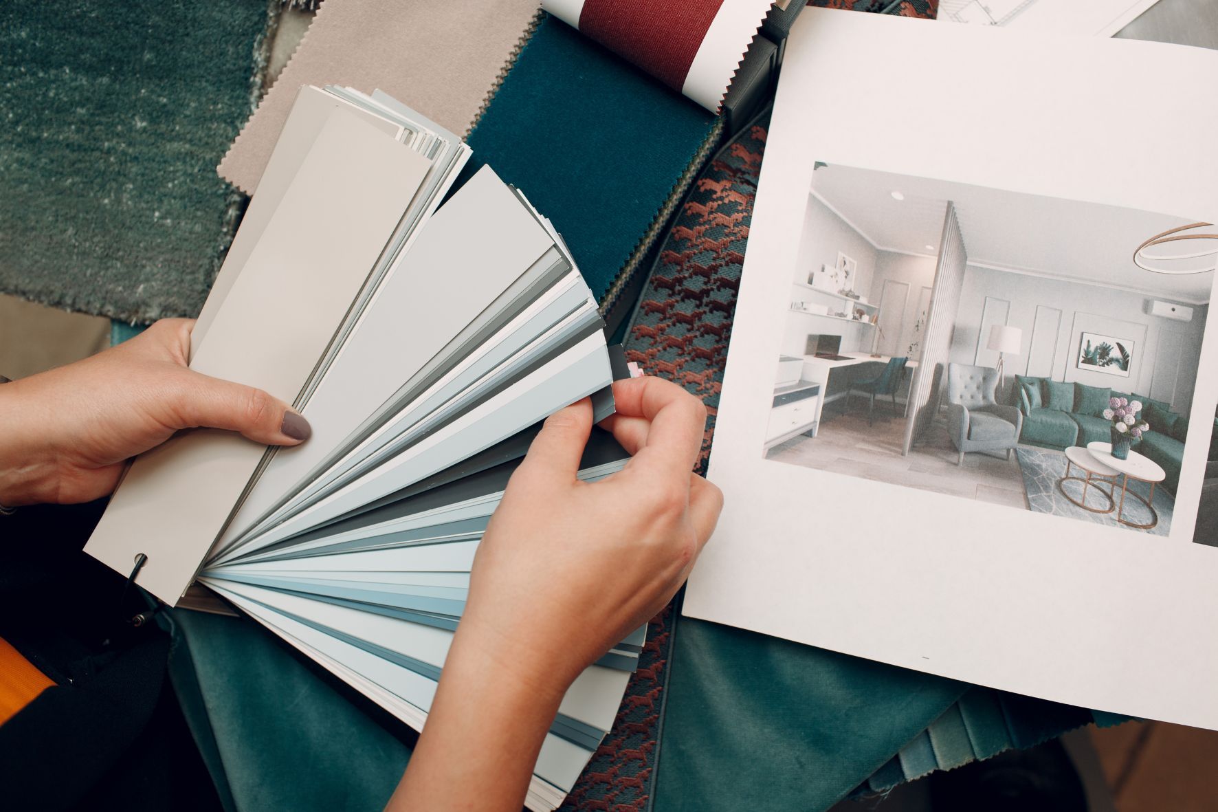
Use Them as Reference Points for Other Design Decisions
Paint swatches can also be helpful as reference points, allowing you to compare shades to rugs, art, or textiles that you plan to keep or add to your space. One way to use paint chips effectively is to match them with certain fabrics or other elements that you already have in the room. This can help coordinate colors and create a cohesive look.
Still set on using paint swatches to make a color decision? Go a shade darker or brighter than what you think you need. This will give you a more dramatic effect and add more character to your space.
Integrating Paint Swatches into the Overall Design Process
Despite their limitations, paint swatches can be a useful part of the design process when used correctly. Here’s how to integrate them effectively.
Understanding Undertones
One of the most important aspects of choosing paint is understanding undertones. Paint swatches can help you identify the subtle undertones of a color, which can be crucial in ensuring that your paint choice complements other elements in the room. For instance, a beige with pink undertones might clash with the warm wood tones of your furniture, while a beige with yellow undertones might complement it perfectly.
Creating Mood Boards
Using paint swatches to create mood boards can be a highly effective way to visualize how different elements of your room will work together. By placing swatches alongside fabric samples, flooring options, and images of furniture, you can get a better sense of how the colors will interact. This holistic approach can help prevent costly mistakes and ensure a more cohesive design.
Lighting Considerations
Lighting can dramatically affect how a paint color looks in a room. Natural light, incandescent bulbs, fluorescent lights, and LED lighting can all change the appearance of a color. Paint swatches can help you see how a color will look under different lighting conditions. Try placing swatches in different parts of the room and observing how they look at various times of the day.
Consulting with Professionals
While DIY projects can be rewarding, consulting with a professional designer or color consultant can provide valuable insights. Professionals can help you understand the nuances of color and how to use paint swatches effectively. They can also suggest color combinations and finishes that you might not have considered.
Practical Tips for Using Paint Samples
To make the most of your paint samples and ensure the best possible outcome for your painting project, follow these practical tips:
Paint Large Sections: Instead of just painting a small area, try to cover a larger section of the wall. This will give you a better idea of how the color will look when applied to a broader area. Aim for at least a 2-foot by 2-foot section. Test in Multiple Locations: Paint samples in different parts of the room to see how the color changes with varying light conditions. Observe the samples at different times of the day and under different lighting to get a complete picture.
Compare Several Colors: Don’t limit yourself to one or two samples. Test multiple colors to see which one works best in your space. Sometimes the color you thought you would love might not be the best choice once you see it on the wall.
Consider Different Finishes: The finish of the paint can also affect how the color looks. Test samples in the finish you plan to use, whether it’s matte, eggshell, satin, or gloss. Different finishes reflect light differently and can change the appearance of the color.
While paint swatches and chips have their limitations, they can still be a valuable part of the color selection process when used correctly. Understanding the drawbacks of relying solely on swatches and incorporating paint samples, online visualizers, and professional advice can help you make the best color choices for your space.
By taking a holistic approach and considering all the factors that influence how a color looks in your room, you can avoid common pitfalls and achieve a beautiful, cohesive design. Whether you’re painting a single room or your entire home, the right preparation and tools can make all the difference in creating a space that you love.