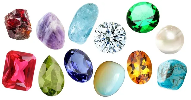
Choosing the perfect paint colors for your home can feel overwhelming. But what if you could draw inspiration from something as personal as your birthstone?
In this comprehensive guide, we’ll explore stunning Sherwin-Williams paint palettes inspired by each month’s birthstone, helping you create spaces that resonate with meaning and beauty.
Monthly Birthstone Paint Palettes
January: Garnet’s Rich Warmth
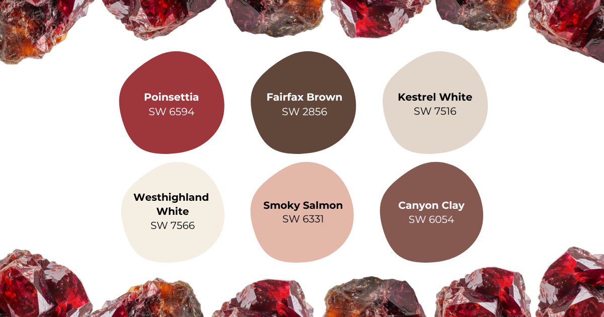
The garnet’s deep crimson hues have captivated people for millennia, symbolizing faith, love, and unwavering courage. In interior design, these rich red tones create spaces that feel both energetic and nurturing. The garnet palette is particularly effective in rooms where you want to encourage conversation and connection, such as dining rooms or family gathering spaces. The deep red of Poinsettia SW 6594 serves as a dramatic focal point, while Smoky Salmon SW 6331 offers a softer, more approachable variation that works beautifully on accent walls or in architectural details.
For balance, Westhighland White SW 7566 provides a clean, warm backdrop that prevents the space from feeling overwhelming. Fairfax Brown SW 2856 grounds the palette with its earthy undertones, making it perfect for trim work or furniture. Consider using these colors in spaces that receive plenty of natural light, as the garnet tones become even more dynamic when illuminated.
Featured Colors:
- Poinsettia SW 6594
- Smoky Salmon SW 6331
- Westhighland White SW 7566
- Fairfax Brown SW 2856
- Kestrel White SW 7516
- Canyon Clay SW 6054
February: Amethyst’s Royal Touch
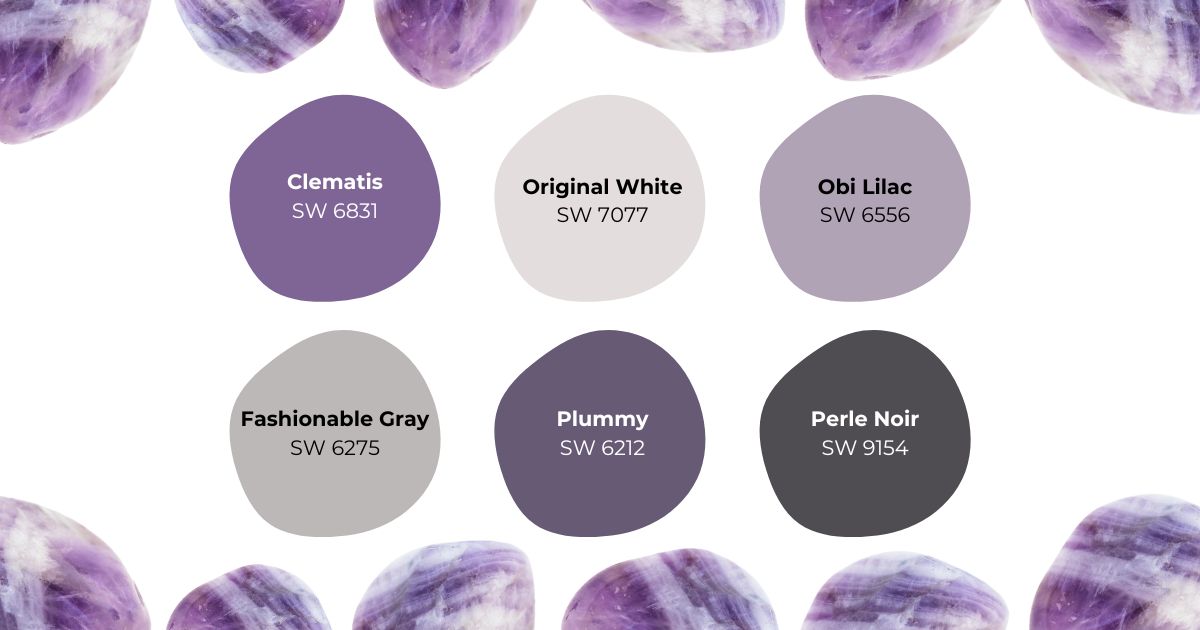
Amethyst’s legendary purple hues have long been associated with nobility, spiritual awareness, and inner peace. This gemstone’s color palette brings an air of sophistication to any space while maintaining a sense of mystery and depth. The deep purple of Clematis SW 6831 creates stunning accent walls that seem to shift and change throughout the day, while Plummy SW 6558 offers a more subdued option that works beautifully in larger spaces.
In bedrooms, these purple tones promote restful sleep and meditation, while in home offices or libraries, they enhance focus and creativity. Original White SW 7077 serves as a sophisticated neutral that complements the purple tones without competing with them. The addition of Fashionable Gray SW 6275 provides a modern edge that prevents the palette from feeling too traditional or feminine.
Featured Colors:
- Clematis SW 6831
- Original White SW 7077
- Plummy SW 6558
- Perle Noir SW 9154
- Obi Lilac SW 6556
- Fashionable Gray SW 6275
March: Aquamarine’s Serene Beauty
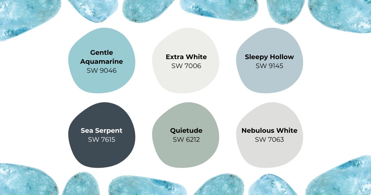
Named for the sea itself, aquamarine embodies the tranquil qualities of coastal waters. This gemstone’s palette brings a sense of peace and clarity to interior spaces, making it particularly effective in rooms where you want to promote relaxation and clear thinking. Gentle Aquamarine SW 9046 captures the essence of shallow tropical waters, while Sea Serpent SW 7615 provides the depth and drama of deeper ocean tones.
These colors work exceptionally well in bathrooms and spa-like spaces, creating a sense of luxury and escape. When used in home offices or study areas, the aquamarine palette enhances focus and creativity while maintaining a calm atmosphere. Extra White SW 7006 adds brightness and clarity, while Quietude SW 6212 provides a softer, more contemplative note that ties the whole palette together.
Featured Colors:
- Gentle Aquamarine SW 9046
- Extra White SW 7006
- Sleepy Hollow SW 9145
- Sea Serpent SW 7615
- Quietude SW 6212
- Nebulous White SW 7063
April: Diamond’s Timeless Brilliance
The diamond’s unmatched clarity and sparkle have made it the ultimate symbol of pure light and eternal love. This palette captures the gem’s ability to refract light into countless brilliant hues. High Reflective White SW 7757 serves as the foundation, mimicking the diamond’s legendary clarity while creating an expansive feel in any space. Rhinestone SW 7656 adds a sophisticated metallic undertone that shifts beautifully as light changes throughout the day.
Modern spaces particularly benefit from this palette’s clean lines and bright energy. The addition of Blissful Blue SW 6527 brings a cool, crystalline quality reminiscent of the finest blue-white diamonds, while Country Squire SW 6475 grounds the space with deeper tones that prevent the brightness from becoming overwhelming. Consider this palette for contemporary kitchens, bright living areas, or anywhere you want to maximize natural light and create an uplifting atmosphere.
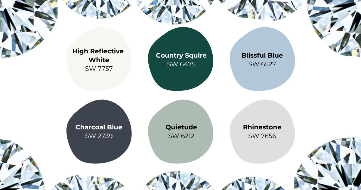
Featured Colors:
- High Reflective White SW 7757
- Country Squire SW 6475
- Blissful Blue SW 6527
- Quietude SW 6212
- Rhinestone SW 7656
- Charcoal Blue SW 2739
May: Emerald’s Natural Elegance
The emerald’s deep green depths have long symbolized growth, prosperity, and new beginnings. This palette captures both the intensity and subtle variations found in fine emeralds. Hunt Club SW 6468 provides the deep, rich green that emeralds are famous for, while Gallery Green SW 0015 offers a lighter, more versatile option that brings energy to larger spaces.
In home offices, this palette promotes focus and creativity while maintaining a connection to nature. Living rooms benefit from the combination of Intimate White SW 6322‘s soft glow and Jasper SW 6216‘s earthy undertones. The emerald palette works particularly well in spaces with natural wood elements or abundant plant life, creating a seamless flow between indoor and outdoor spaces. These colors also excel in rooms that receive filtered natural light, as they become more dynamic and nuanced throughout the day.
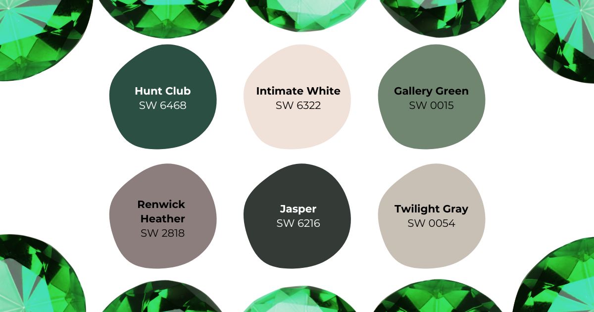
Featured Colors:
June: Pearl’s Timeless Grace
Pearls have long represented purity and wisdom, with their subtle iridescence creating an ever-changing display of soft colors. This sophisticated palette captures the pearl’s gentle luminosity and adaptability. Cultured Pearl SW 6028 provides a luminous base that seems to glow from within, while Pure White SW 7005 adds brightness without harsh contrast.
The addition of Studio Mauve SW 0062 brings warmth and depth reminiscent of rare pink pearls, while Essential Gray SW 6002 provides structure and grounding. This versatile palette excels in formal dining rooms, master bedrooms, or any space where you want to create an atmosphere of refined elegance. The colors work exceptionally well with both traditional and contemporary furnishings, making them perfect for transitional spaces that blend different design styles.
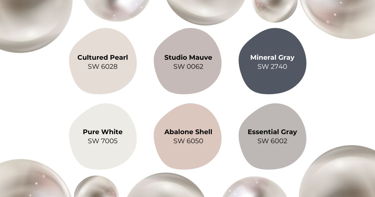
Featured Colors:
July: Ruby’s Bold Statement
The ruby’s intense red hue has symbolized passion, power, and vitality for centuries. This dramatic palette captures both the gem’s fiery nature and its sophisticated depth. Show Stopper SW 7588 delivers the bold impact of a fine ruby, creating stunning focal points whether used on an accent wall or as a room’s primary color. Fine Wine SW 6307 offers a deeper, more mysterious take on the ruby’s essence.
These dramatic reds are balanced by Arcade White SW 7100‘s clean brightness and Sand Trap SW 6066‘s warm neutral tones. This combination works particularly well for spaces where you want to make a strong first impression, such as entryways, dining rooms, or home libraries. The palette’s versatility allows it to work equally well in both traditional and modern settings, especially when paired with metallic accents that enhance the ruby’s natural brilliance.
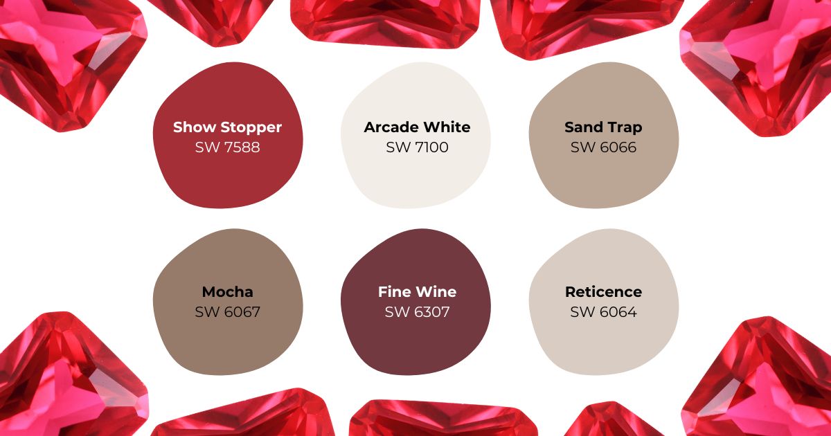
Featured Colors:
August: Peridot’s Fresh Perspective
Peridot’s distinctive yellow-green color brings a unique energy to interior spaces, symbolizing abundance and opportunity. Edamame SW 7729 captures the gemstone’s characteristic lime-tinged green, while Muddled Basil SW 7745 provides deeper, more grounding tones that prevent the brighter greens from becoming overwhelming.
This palette’s natural freshness makes it perfect for kitchens and gathering spaces, where its energy promotes conversation and connection. Alabaster SW 7008 provides a soft, warm white that complements the greens without competing with them, while Tony Taupe SW 7038 adds sophistication and depth. These colors work particularly well in spaces with plenty of natural light, as they seem to shift and change throughout the day, much like the gemstone itself.
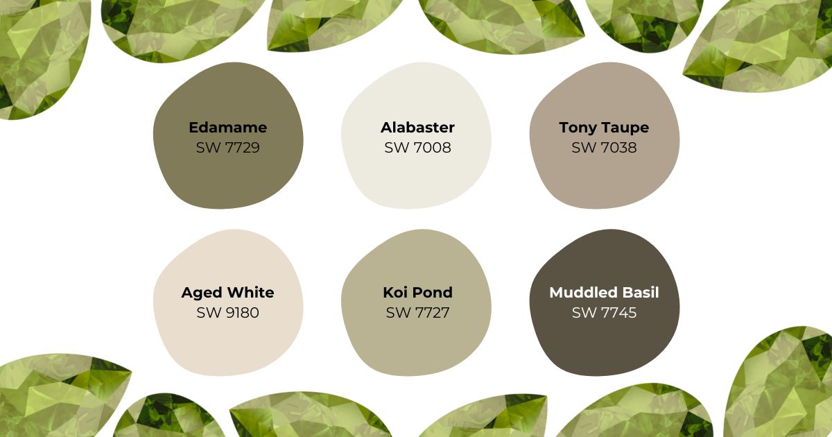
Featured Colors:
September: Sapphire’s Deep Mystery
Sapphire, with its profound blue depths, symbolizes truth, loyalty, and divine wisdom. The deep blue of Indigo SW 6531 captures the essence of the finest Kashmir sapphires, creating spaces that feel both luxurious and contemplative. Mediterranean SW 7617 provides a lighter variation that brightens the palette while maintaining the gem’s characteristic depth.
Pure White SW 7005 acts as a canvas for these rich blues, while Silver Strand SW 7057 adds a metallic sophistication reminiscent of the gem’s natural brilliance. This palette excels in master bedrooms, formal dining rooms, and executive home offices, where its depth creates an atmosphere of quiet authority. When used in bathrooms or powder rooms, these colors create a spa-like atmosphere, especially when paired with chrome or brushed nickel fixtures.
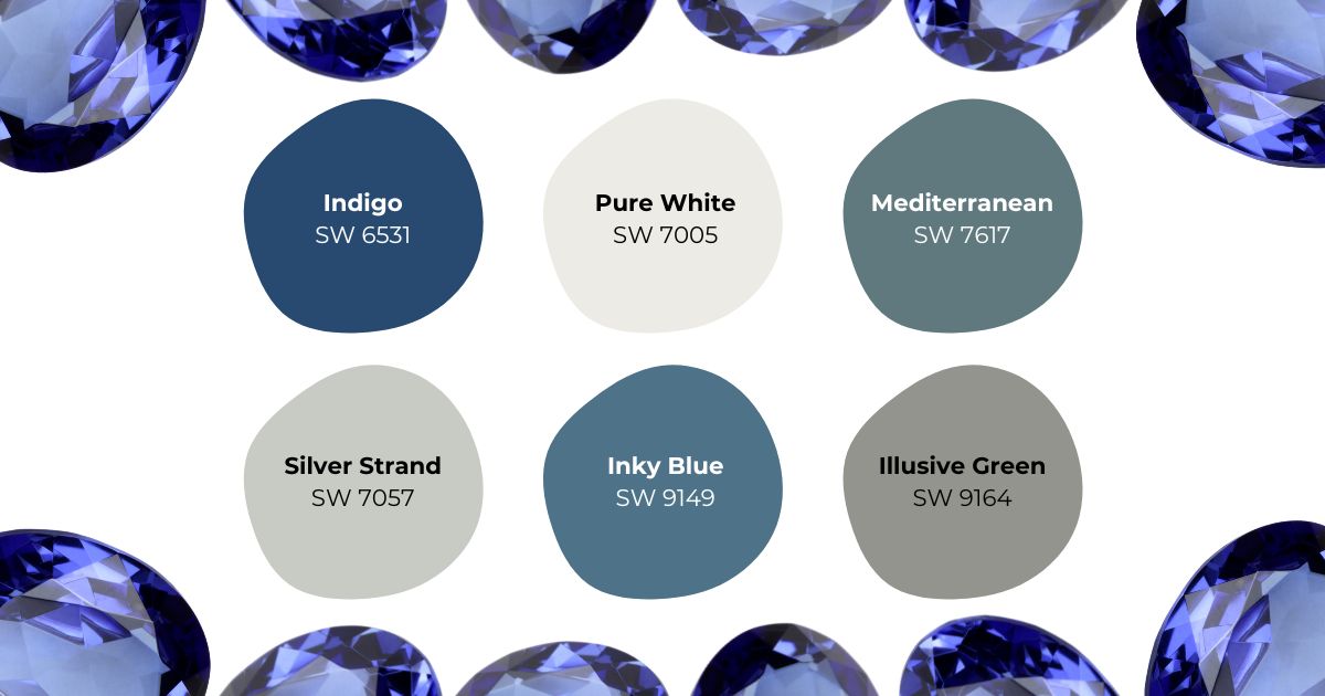
Featured Colors:
October: Opal’s Ethereal Charm
The opal’s ever-changing play of colors makes it one of nature’s most captivating gems. This palette captures its iridescent quality through carefully balanced hues. Opalescent SW 9686 provides a shimmering base that seems to shift with changing light, while Take Five SW 6513 adds cool undertones reminiscent of the gem’s blue flashes.
Rainwashed SW 6211 brings a soft, ethereal quality to the palette, and Westchester Gray SW 2849 provides structure without heaviness. These colors work beautifully in creative spaces, nurseries, or meditation rooms, where their subtle interplay creates a sense of wonder and possibility. The palette is particularly effective in rooms with multiple light sources, as it reveals different aspects throughout the day.
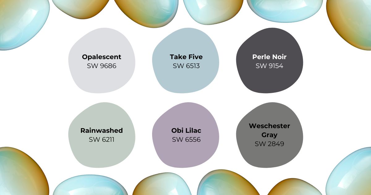
Featured Colors:
November: Topaz’s Warm Embrace
Imperial topaz’s golden-brown hues bring warmth and vitality to interior spaces. Smokey Topaz SW 6117 captures the gem’s rich amber tones, while Gold Coast SW 6376 adds a sunny brilliance that energizes any room. This combination is particularly effective in spaces dedicated to wellness and rejuvenation.
Moderate White SW 6140 provides a warm, welcoming backdrop that enhances the palette’s golden tones, while Iron Ore SW 7069 adds depth and sophistication. These colors excel in home gyms, yoga studios, or meditation spaces, where their warmth promotes both energy and relaxation. The palette also works beautifully in south-facing rooms, where natural light enhances its golden qualities throughout the day.
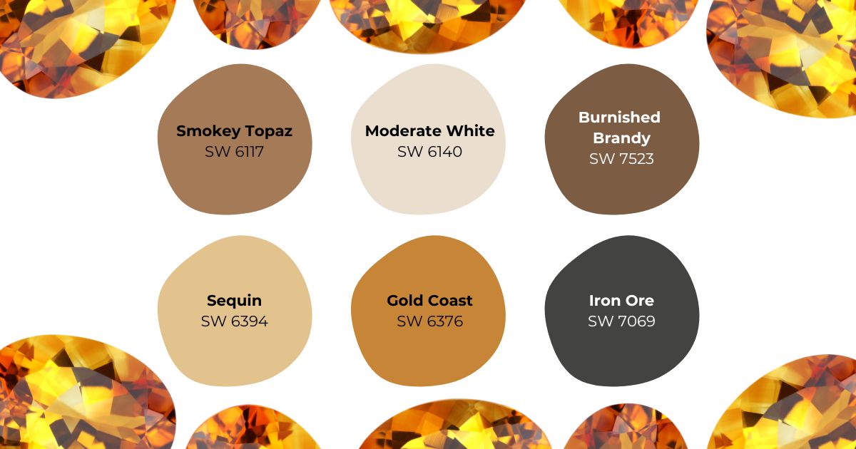
Featured Colors:
December: Turquoise’s Joyful Spirit
Turquoise, with its unique blue-green hue, has been cherished for millennia as a symbol of protection and positive energy. Holiday Turquoise SW 0075 captures the gem’s signature color, creating spaces that feel both invigorating and serene. Tradewind SW 6218 offers a softer variation that works beautifully on larger surfaces.
Extra White SW 7006 provides crisp contrast that enhances the turquoise tones, while Golden Rule SW 6383 adds warm accents reminiscent of the gem’s natural matrix patterns. This palette is particularly effective in entryways, where it creates a welcoming first impression, or in sunrooms where natural light brings out its vibrant energy. The colors also work well in home offices or creative spaces, where their positive energy promotes productivity and inspiration.
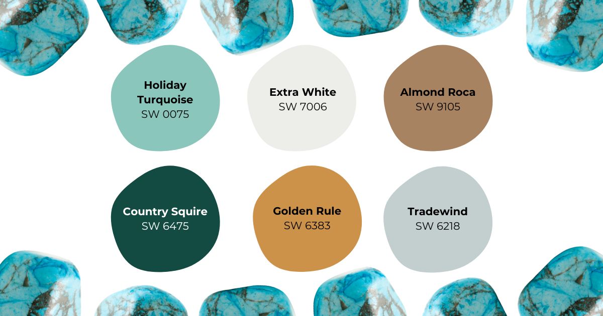
Featured Colors:
Why Choose Tru Colors Contracting for Your Painting Project
Consider partnering with Tru Colors Contracting for your painting needs. As a licensed and certified contractor, Tru Colors Contracting brings expertise and precision to every project. Our professional painters are trained in the latest application techniques and use premium Sherwin-Williams products.
Benefits of working with Tru Colors Contracting:
- Professional color consultation services
- Expert surface preparation and paint application
- Detailed project timelines and transparent pricing
- Fully insured and bonded teams
- Specialized experience with both interior and exterior painting
Contact Us today to schedule your free estimate!
