Healing and healthy, nature is a commanding force. By bringing hues from the great outdoors into your home, you’ll enjoy the restorative effects of fresh air, blue sky, and life-giving natural energy. Here are eight ways to embrace outdoor elements indoors using paint color.
1. Embrace Outdoor Elements Indoors
Earth, Water, Fire, and Air
Nature’s classical elements—earth, water, fire, and air—serve as powerful design influences. By integrating these elements into your home, you can create a harmonious and balanced environment. These elements can be represented through various materials and colors, each adding a unique touch to your space.
Earth
Earth tones like browns, greens, and taupes can ground a space, providing a sense of stability and warmth. Use these colors on walls, furniture, and decor items. Natural materials such as exposed brick walls, forged metal, stone fireplaces, and wooden floors echo the raw beauty of the earth. Incorporating plants, whether hanging or potted, brings a touch of the outdoors inside and enhances the natural feel of your space.
Water
Water elements can be incorporated through shades of blue and aqua, which bring a sense of calm and tranquility. These colors can be used in bedrooms and bathrooms to create a spa-like atmosphere. Water features, like fountains or aquariums, can also be used to bring the soothing sounds and visual appeal of water into your home.
Fire
Fire elements are represented through warm colors like reds, oranges, and yellows. These hues can create a cozy and inviting atmosphere. Use these colors in living rooms or dining areas to promote conversation and warmth. Candles and fireplaces can also add to the fiery element, bringing both warmth and a focal point to the room.
Air
Air elements are light and airy, represented through colors like whites, light grays, and soft blues. These colors can make a space feel larger and more open. Use light, breezy fabrics for curtains and furniture to enhance the airy feel. Large windows and open spaces also help to bring in the element of air, making the space feel connected to the outdoors.
Gradations from Natural Elements
Start with neutral tones, greiges, and taupes already present in your home. Add depth and dimension by choosing light, medium, and dark paint tones that reflect natural elements. This layering technique creates a dynamic and engaging space that evolves throughout the day as the light changes.
Light Tones: Light tones can make a room feel more spacious and airy. These colors are perfect for smaller rooms or areas that need to feel open and bright. Examples include soft whites, light grays, and pale blues. These colors reflect light well and can make a space feel larger.
Medium Tones: Medium tones add warmth and comfort to a room. These colors are great for living areas and bedrooms, where you want to create a cozy atmosphere. Examples include warm beiges, soft greens, and mid-tone blues. These colors provide a perfect balance between light and dark, creating a welcoming environment.
Dark Tones: Dark tones add drama and depth to a room. These colors are perfect for accent walls or areas where you want to create a focal point. Examples include deep blues, rich browns, and charcoal grays. These colors can make a space feel intimate and sophisticated.
2. Make Any Room a Sunroom
Sunny Yellow Hues
Bring sunny warmth into any room with pale and mid-tone yellow hues. These colors not only enhance the room’s light but also create an inviting and cheerful atmosphere. Yellow is associated with happiness and energy, making it a perfect color for spaces where you want to feel uplifted and energized. Here are some of Yellow picks from Sherwin-Williams.
Daybreak SW6700: Daybreak is a classic soft yellow that brings a gentle warmth to any room. This color is perfect for bedrooms and nurseries, creating a calm and soothing environment.
Fun Yellow SW 6908: Fun Yellow is a popular sunny yellow. This color is ideal for kitchens and dining areas, where you want to create a bright and cheerful atmosphere.
Naples Yellow SW 9021: Naples Yellow is an earthy honey tone that adds warmth and richness to a space. This color is perfect for living rooms and hallways, where you want to create a welcoming and cozy environment.
Enhancing Light with Sheen
Use sheen or finish to highlight your golden hues. An eggshell sheen or higher (think pearl/satin, semi-gloss, or high-gloss) allows natural light to bounce around your space, creating a bright and airy feel. For a more subdued effect, consider a flat matte finish, which provides a softer look.
Eggshell Sheen: Eggshell sheen provides a slight sheen that reflects light without being too shiny. This finish is perfect for living rooms and bedrooms, where you want a soft and elegant look.
Pearl/Satin Sheen: Pearl/satin sheen provides a more noticeable shine, which is great for kitchens and bathrooms. This finish is easy to clean and adds a touch of sophistication to any room.
Semi-Gloss and High-Gloss Sheen: Semi-gloss and high-gloss sheen provide a bright and reflective finish, which is perfect for trim and doors. These finishes are durable and easy to clean, making them ideal for high-traffic areas.

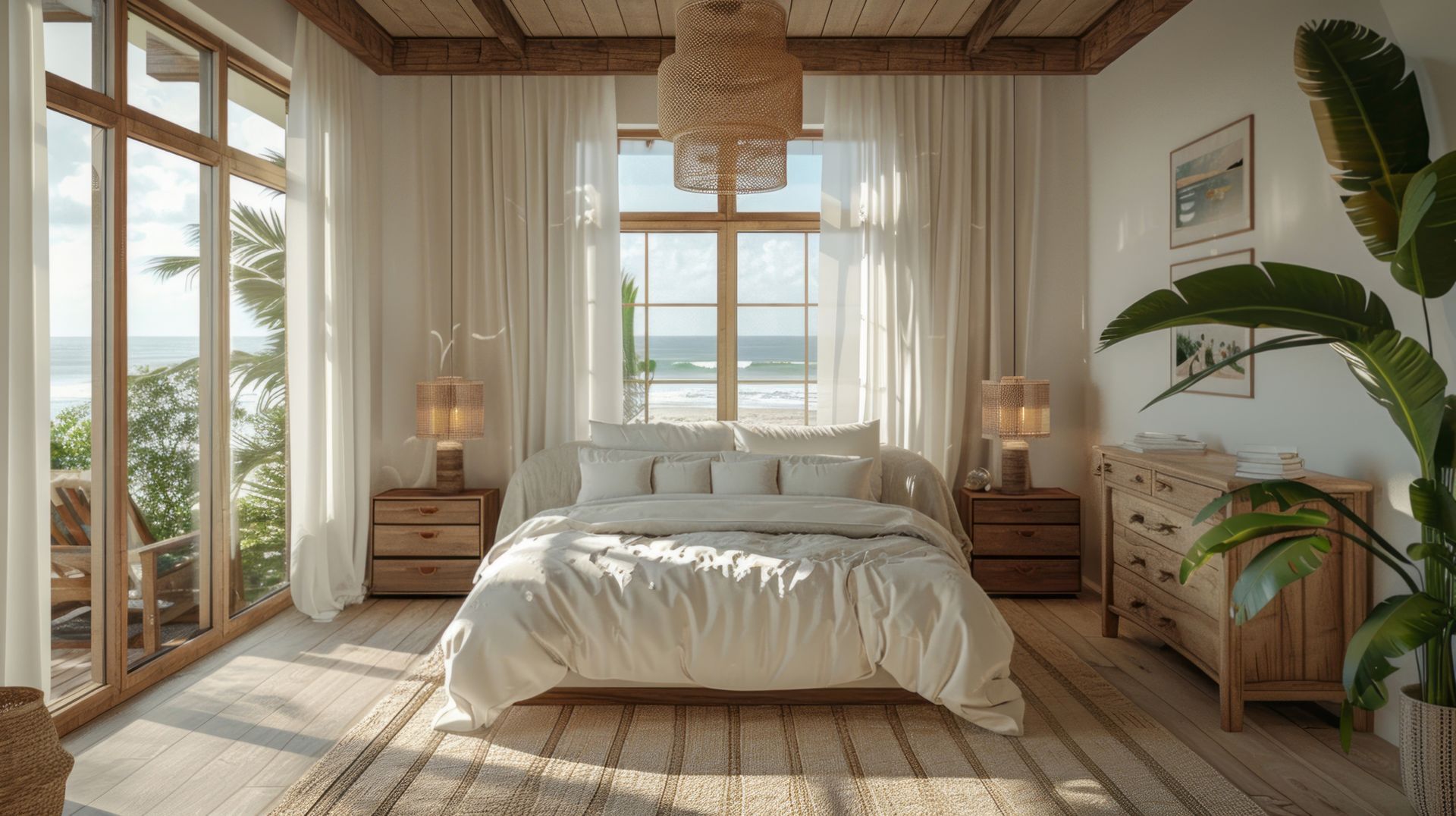
3. Highlight Outdoor Views with Painted Window Trim
Accentuate Beautiful Views
A well-placed window can act as a dynamic piece of art, showcasing seasonal changes in outdoor color and texture. To accentuate a beautiful window view, consider painting the window trim in a contrasting color to make the view stand out.
Darker Trim
Painting window trim in a darker shade than your wall can create a striking contrast. For example, rich and sumptuous Sea Mariner SW9640 -painted mullion can be complemented by light Sleepy Blue SW6225 outer window trim. Against white walls, this combination creates a colorful lens through which to view the natural world. This approach draws the eye towards the window and the view beyond, making the outdoors feel like an integral part of your interior space.
Lighter Trim
Painting trim in a lighter color against deeper-hued walls is another effective approach. Bright, crisp white-painted trim pops against deep hues, drawing the eye outward. This technique works well in rooms with darker walls, as the light trim provides a fresh and clean contrast, highlighting the window and the view outside.
Creating a Frame for Nature
By using contrasting colors for window trim, you effectively create a frame for the natural world outside. This not only enhances the visual appeal of the window but also emphasizes the connection between indoor and outdoor spaces. Consider using colors that complement the natural landscape visible from your window to further integrate the outdoors into your home.
4. White Paint Colors as a Base for Natural Décor
Enhancing Spaces with White
White painted walls enhance spaces by providing the perfect canvas for natural décor. White is versatile and timeless, making it an ideal choice for any room in your home. Warmer white hues such as Honied White SW7106 , White Flour SW7102 , or Alabaster SW7008 are ideal choices. These shades provide a neutral backdrop that complements a wide range of natural materials and colors.
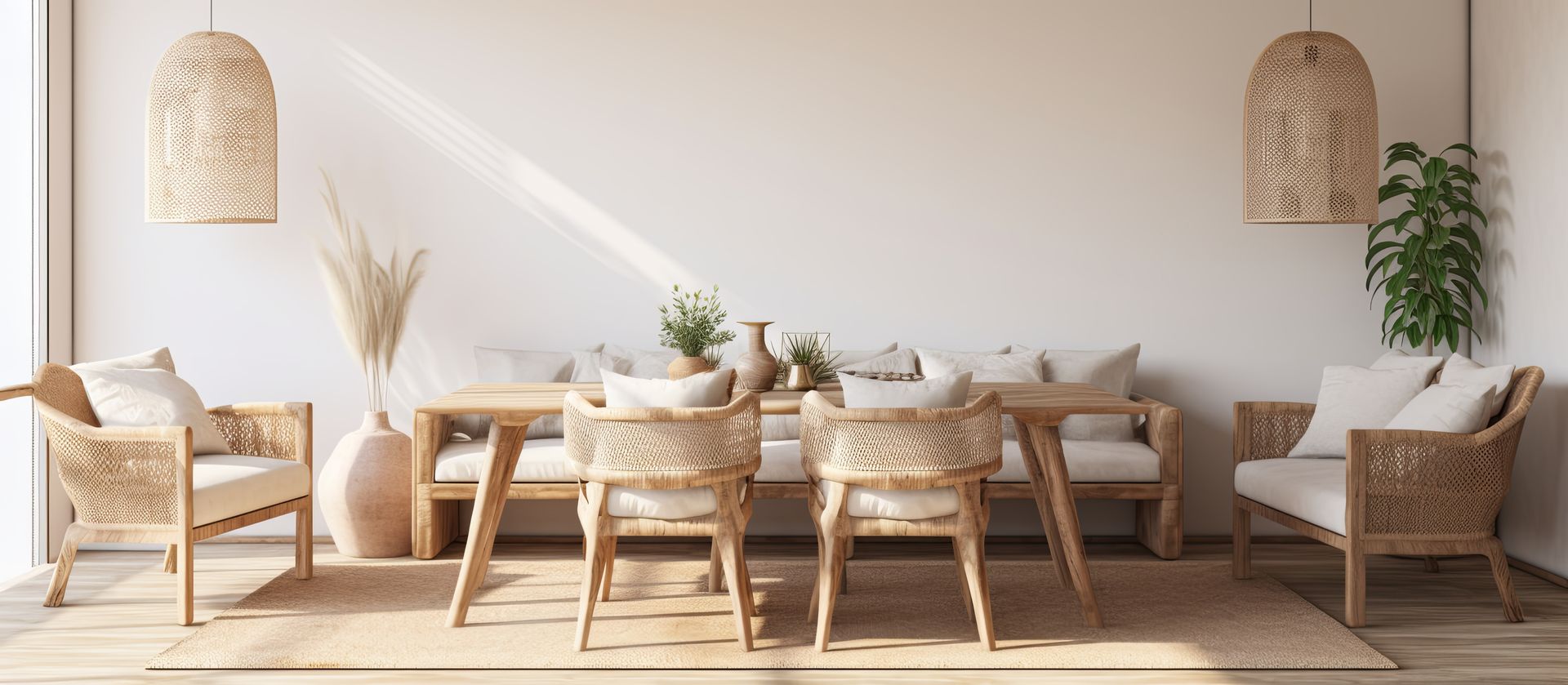
Natural Materials for Texture
Complement white walls with natural materials like rattan, wicker, cane, sisal, and sea grass. These materials bring tactility, warmth, and nature’s vitality to any space, creating a cocoon-like vibe that envelops you in comfort.
Rattan and Wicker: Rattan and wicker furniture add a rustic and organic feel to a room. These materials are lightweight and durable, making them perfect for indoor and outdoor use. Pair them with soft cushions and throws for added comfort.
Cane and Sisal: Cane and sisal add texture and natural beauty to your decor. These materials are often used in rugs, baskets, and furniture, providing a touch of nature to your space. Their neutral colors blend seamlessly with white walls, creating a cohesive look.
Sea Grass: Sea grass brings a coastal vibe to your home. Use sea grass baskets, rugs, and decor items to add a touch of the seaside to your interior. These materials are durable and add a unique texture to your space.
5. Watery Hues Elevate Earth Tone Colors
Balancing Warm and Cool Tones
Water, another of nature’s classical elements, beautifully balances warm, natural colors and delivers cool, refreshing vibes. Consider these classic blue-meets-beach color pairings to create a calming and inviting atmosphere in your home.
Upward SW6239 and Westhighland White SW7566
Upward is a soft, calming blue that pairs beautifully with Westhighland White , a warm and inviting white. This combination is perfect for living rooms and bedrooms, where you want to create a serene and relaxing environment.
Rain SW6219 and White Sand SW9582
Use color Rain for a gentle, peaceful mood in your space, with undertones of green and gray. This cool neutral pairs well with White Sand and the combination is ideal for bathrooms and kitchens, where you want to create a spa-like atmosphere.
Endless Sea SW9150 and Shell White SW8917
Endless Sea is a rich, deep blue that pairs beautifully with Shell White , a warm and earthy neutral. This combination is perfect for dining rooms and home offices, where you want to create a sophisticated and calming space.
Ocean-Inspired Accessories
Use seashells, coral, and other natural-inspired accessories to bring ocean-based touches into your home. These elements create calming spaces that welcome and comfort, reminding you of the serene beauty of the seaside.
Seashells
Seashells add a touch of the beach to your decor. Use them in decorative bowls, vases, or as accents on shelves and tables. Their natural shapes and colors bring a sense of the ocean to your space.
Coral
Coral adds texture and color to your decor. Use coral pieces as centerpieces on tables or as accents on shelves. Their unique shapes and vibrant colors add visual interest and a touch of the sea to your home.
Driftwood
Driftwood brings a rustic and natural element to your decor. Use driftwood pieces as wall art, candle holders, or as accents on tables and shelves. Their weathered appearance adds a touch of the beach to your space.
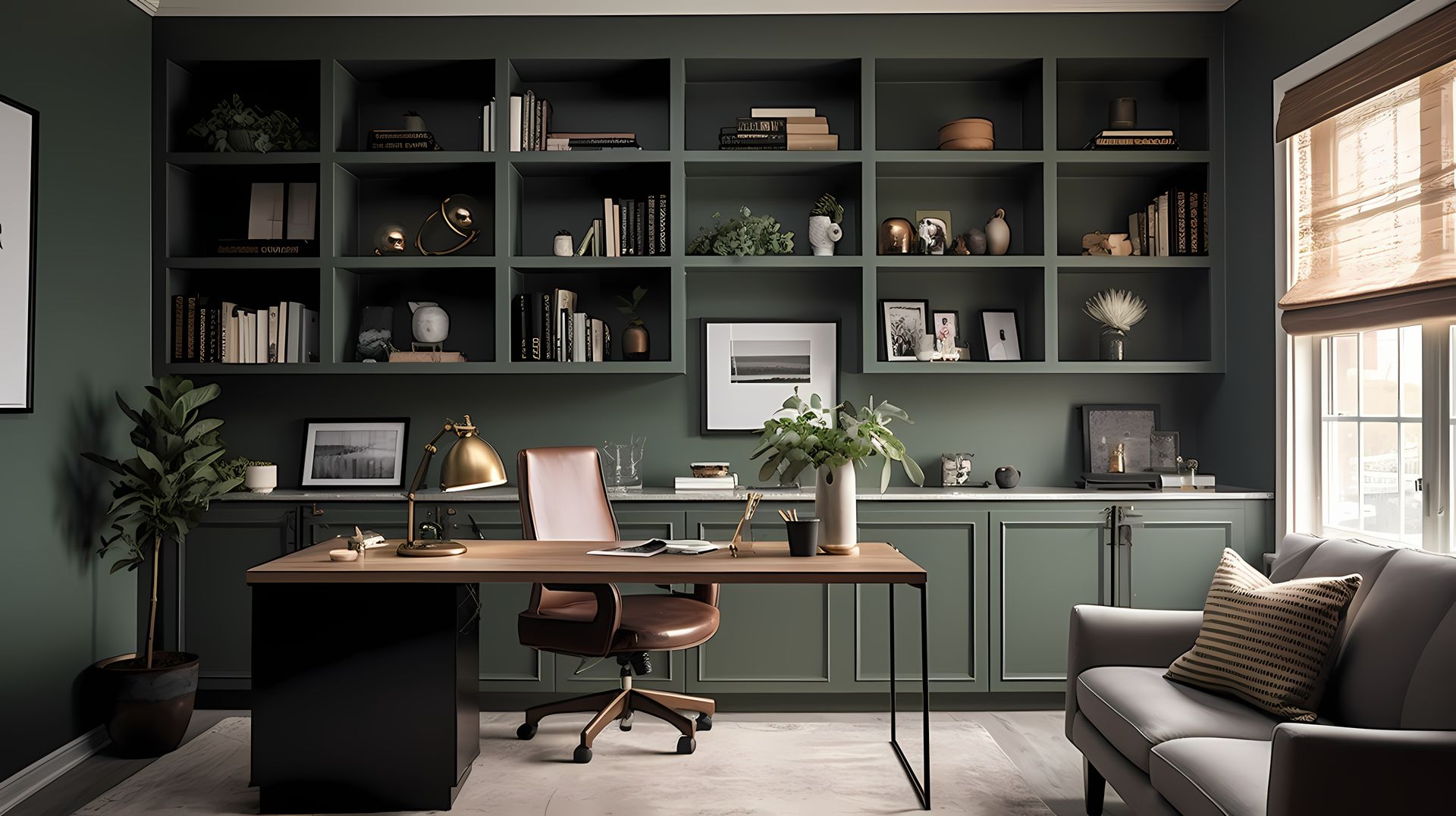
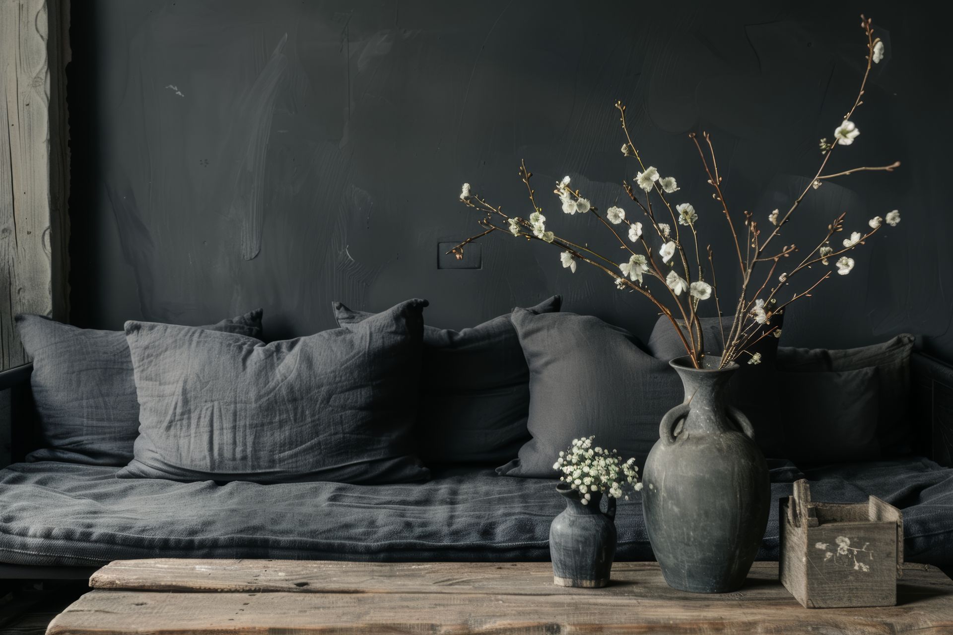
6. Ground Your Space with Dark, Earthy Hues
The Impact of Dark Colors
Darker-hued walls—think dark browns, grays, and black hues—allow natural elements like plants and fresh flowers to pop. These colors add drama and depth to a room, creating a sophisticated and intimate atmosphere.
Dark Browns
Dark browns add warmth and richness to a space. Use these colors on accent walls or in rooms where you want to create a cozy and inviting environment. Pair dark brown walls with lighter furniture and decor to create balance.
Grays
Grays add a modern and sleek look to a room. Use these colors in living rooms, bedrooms, and home offices to create a sophisticated and calming environment. Pair gray walls with bold accent colors for a contemporary look.
Black Hues
Black hues add drama and elegance to a space. Use these colors on accent walls or in small rooms to create a bold and intimate atmosphere. Pair black walls with light furniture and decor to create contrast and visual interest.
Deep Hues for Boho Energy
Lower cabinetry in a deep brown-green can give a boho kitchen space an earthy, homey energy. Some favorite deep hues include:
Ripe Olive SW6209 : Make a bold and colorful statement with this deep green. With its blue-gray undertones, this neutral can offer a well-lit space an intriguing, sophisticated mood.
Clove SW9605 : A deep, earthy brown that brings a sense of grounding and stability to your decor.
Retreat SW6207 : This muted green with blue-gray undertones will fill your space with the fresh feeling of mountain air. An uplifting shade for bedrooms and kitchen cabinets.
7. Natural Materials and Paint Color
Seamless Blending with Nature
Natural materials and finishes blend interiors seamlessly with the outdoors. Combining paint colors with natural materials like wood and stone can create a harmonious and inviting atmosphere in your home. When selecting paint colors, consider hues that complement the rich textures and tones of these natural elements. Earthy shades such as warm browns, soft greiges, and muted greens blend seamlessly with the organic patterns of wood and stone, enhancing their natural beauty.
For instance, a gentle green wall color can highlight the intricate veining in marble countertops, while a deep, earthy brown can bring out the warmth in reclaimed wood beams. By thoughtfully pairing paint colors with natural materials, you can create a cohesive design that feels both timeless and connected to nature, adding depth and character to your living space.
Paint Pairings with Natural Materials
Iron Ore SW7069: This cool, deep and mysterious charcoal can lend an air of sophistication when used sparingly in well-lit spaces, pairs well with rustic or finished wood furniture and floors.
Frosted Fern SW9648: A light soft green perfect for bathrooms to enhance the beauty of a marble surface.
Simple Stone SW9521: A warm neutral perfect for cozy living spaces that embrace the hues of natural stone.
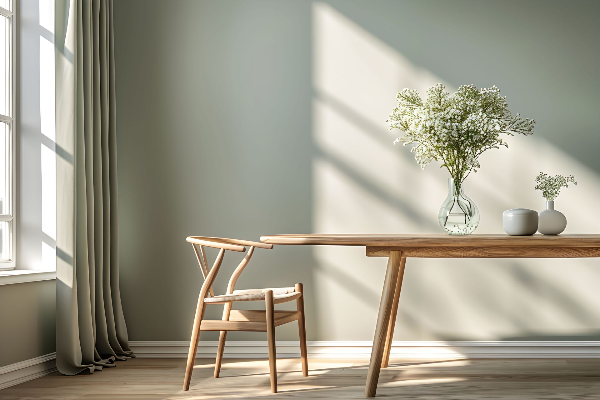
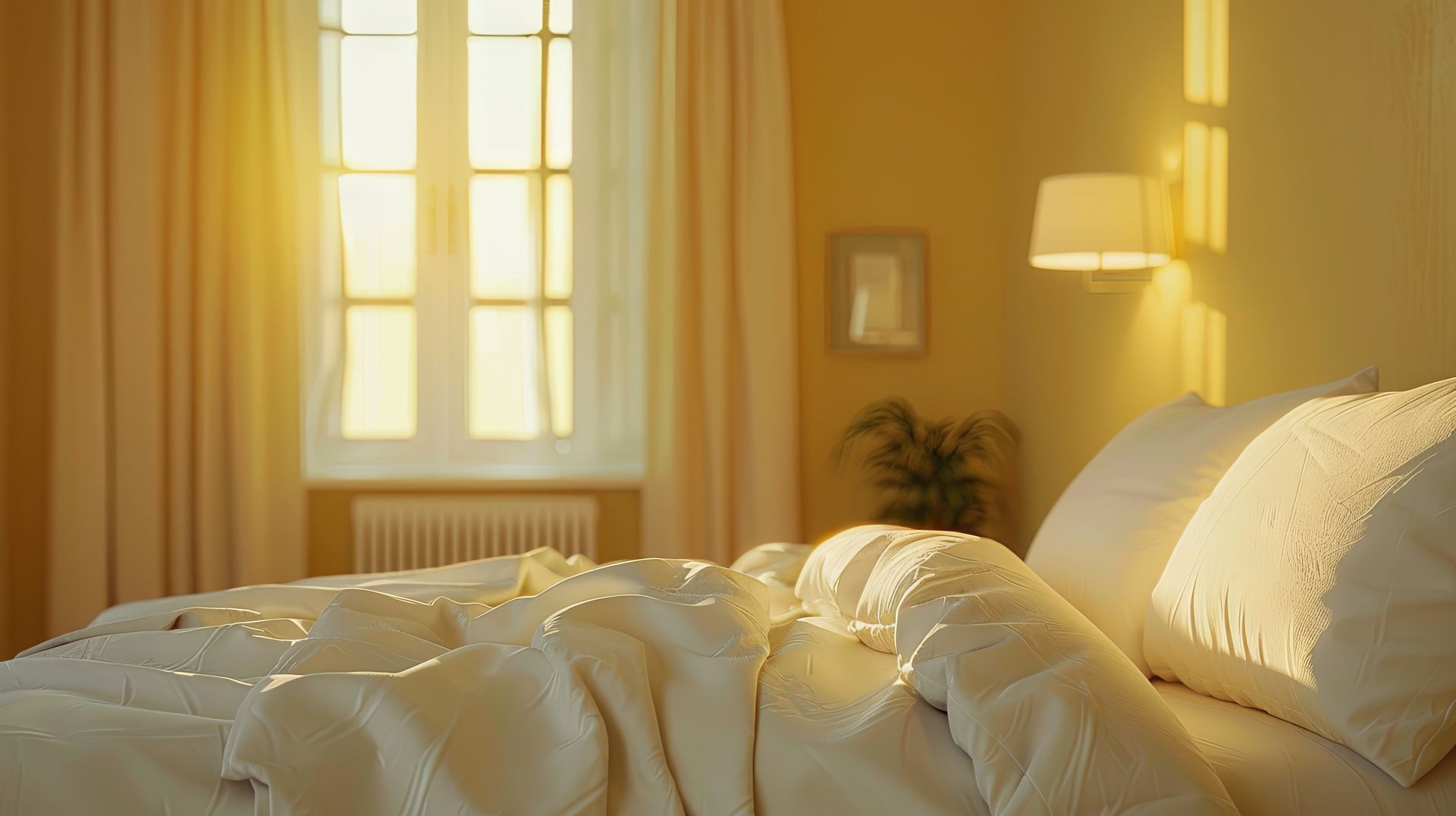
8. Maximize Natural Light & Decor
Reflecting Light with White Paint
Natural light transforms paint colors in beautiful and intriguing ways. Using white paint on interior walls reflects natural light and bounces it around a space. Hanging a mirror across from a window is another effective strategy for maximizing natural light.
Morning Light
Morning light tends to be cool and soft. Colors may appear slightly muted or pastel in the early hours of the day.
Afternoon Light
Afternoon light is bright and warm. Colors may appear more vibrant and saturated during this time.
Evening Light
Evening light is soft and warm, often casting a golden hue. Colors may appear richer and more subdued.
Consider bright, light-enhancing S herwin-Williams paint colors such as:
White Sesame SW9586 : A soft, warm white that enhances natural light and creates a bright and airy atmosphere.
White Snow SW9541 : A classic, timeless white that reflects light beautifully and adds a touch of elegance to any space.
Creamy SW7012 : A light, creamy white that enhances natural light and creates a warm and inviting environment.
Enhancing Spaces with Natural Materials
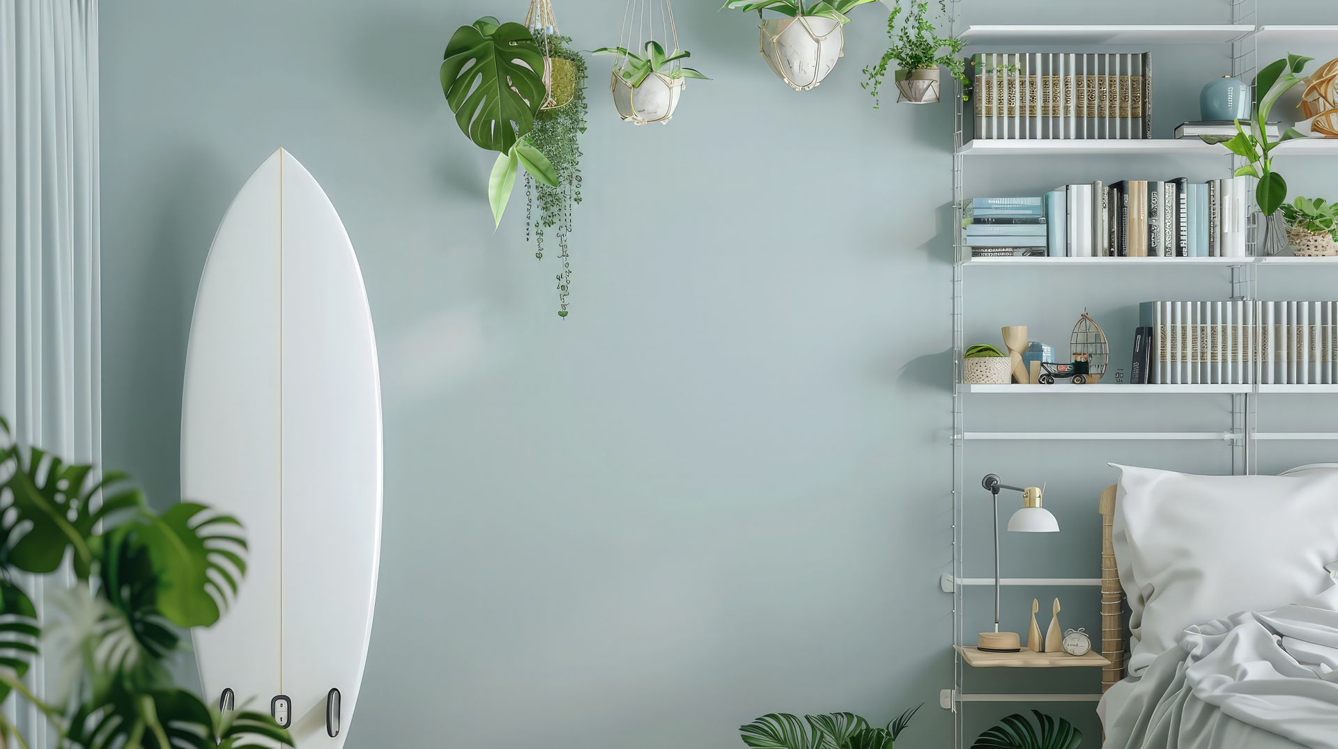
Bamboo, sisal, stone, pearlescent seashells, and raw or reclaimed wood synchronize your indoor space with the outdoors. Whether you opt for live potted plants or high-quality faux greenery, indoor plants are always a great idea. Use green, taupe, brown, and blue paint colors to highlight your natural home accents.
Plants: Incorporating plants into interior design brings a touch of nature indoors, creating a vibrant and refreshing atmosphere. Plants add color, texture, and life to any space, enhancing its aesthetic appeal while also purifying the air and promoting a sense of well-being. Whether you choose large potted plants for a dramatic statement or smaller succulents for subtle accents, the greenery can complement various design styles. Strategically placed plants can highlight architectural features, fill empty corners, and create focal points, making your home feel more dynamic and connected to the natural world.
Sisal: Sisal adds texture and warmth to your decor. Use sisal rugs, baskets, and decor items to bring a touch of nature to your space. Sisal is durable and easy to clean, making it perfect for high-traffic areas.
Stone: Stone adds a rustic and natural element to your decor. Use stone tiles, countertops, and decor items to create a natural and timeless look. Stone is durable and low-maintenance, making it perfect for kitchens and bathrooms.
By thoughtfully selecting and applying paint colors that evoke the essence of the great outdoors, you can transform your home into a serene and rejuvenating sanctuary. Integrating natural hues—whether through earthy browns, calming blues, refreshing greens, or sunny yellows—creates a seamless flow between indoor and outdoor spaces. These colors, combined with natural materials like wood, stone, and plants, enhance the ambiance, making your interiors feel more vibrant and alive. Embracing the beauty of nature within your home not only elevates its aesthetic appeal but also promotes a sense of peace and well-being. So, take inspiration from the natural world and let it guide your color choices, creating a harmonious and inviting environment that brings the outdoors in.